If you regularly create titles, lower thirds, captions, labels, or Motion Graphics Templates in Adobe After Effects, you’ve probably encountered this problem:
You create a text layer.
You place a rectangle behind it.
Everything looks perfect.
Then you change the text.
Suddenly, the rectangle is:
- too short;
- too wide;
- too tall;
- badly positioned.
You resize it manually.
Then the text changes again.
There is a much better solution.
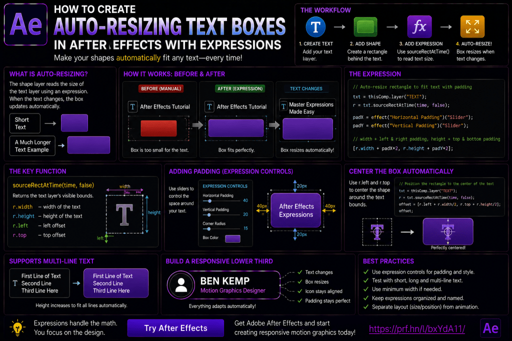
Using After Effects expressions and the sourceRectAtTime() function, you can create a background box that automatically changes size whenever the text changes.
Type a short name and the box becomes smaller.
Type a long headline and the box expands.
Add another line and the box becomes taller.
You can even add adjustable padding, automatically position icons, and build complete responsive title systems.
In this guide, we’ll create an auto-resizing text box from scratch and explore how sourceRectAtTime() can become the foundation of responsive motion graphics in After Effects.
Affiliate disclosure: This article contains affiliate links. If you purchase Adobe After Effects through one of these links, we may earn a commission at no additional cost to you.
What Is an Auto-Resizing Text Box?
An auto-resizing text box is a Shape Layer background whose dimensions are automatically calculated from the size of a Text Layer.
For example:
Text: Ben
creates a relatively narrow box.
Change the text to:
Adobe After Effects Tutorial
and the box automatically becomes wider.
You don’t manually resize anything.
The relationship is controlled by an expression.
Why Auto-Resizing Text Boxes Are Useful
Responsive text boxes are particularly useful for:
- lower thirds;
- name tags;
- subtitles;
- captions;
- callouts;
- buttons;
- social-media graphics;
- news graphics;
- product labels;
- Motion Graphics Templates.
They are especially valuable when text content changes frequently.
The Basic Idea
Our system will contain two layers:
Text Layer
and:
Shape Layer
The Shape Layer reads the dimensions of the Text Layer.
Conceptually:
Text width
↓
Rectangle width
and:
Text height
↓
Rectangle height
Then we’ll add extra space around the text.
That extra space is called:
padding.
What Is sourceRectAtTime()?
sourceRectAtTime() is an After Effects expression method that can return information about the visible rectangular bounds of certain layers.
For a text layer, it can provide useful measurements including:
- width;
- height;
- top;
- left.
These values let expressions understand how large the text currently is.
Why sourceRectAtTime() Matters
Without sourceRectAtTime(), the rectangle doesn’t know whether the text says:
Hi
or:
Welcome to Adobe After Effects
With sourceRectAtTime(), the expression can measure the text and react automatically.
This turns a fixed design into a responsive one.
Step 1: Create a Composition
Create a new After Effects composition.
For example:
1920 × 1080
Add a background if you want the title to be easier to see.
Step 2: Create Your Text
Select the Type Tool.
Create a text layer.
Enter something simple such as:
After Effects
Style the text using your preferred:
- font;
- size;
- weight;
- color.
Rename the layer:
TITLE
Clear layer names make expressions much easier to manage.
Step 3: Create the Background Shape
Create a Shape Layer.
Add a rectangle.
Give it a Fill.
Place it behind the text.
Rename the Shape Layer:
TITLE BACKGROUND
At this point, the rectangle is still manually sized.
Step 4: Find Rectangle Path Size
Expand:
TITLE BACKGROUND
Then:
Contents
Then:
Rectangle
Then:
Rectangle Path
Find:
Size
This is the property we’ll control with an expression.
Step 5: Enable an Expression
Alt-click the Size stopwatch on Windows.
Option-click it on macOS.
After Effects opens the expression field.
Now we can tell the rectangle to read the text dimensions.
If you’d like to practice responsive graphics and expressions yourself, you can explore Adobe’s current After Effects options here:
Explore Adobe After Effects and current plans
Step 6: Reference the Text Layer
First, create a reference to the text layer.
Conceptually:
txt = thisComp.layer("TITLE");
Now the expression knows which layer it should measure.
Step 7: Measure the Text
Next, retrieve the text rectangle.
Conceptually:
r = txt.sourceRectAtTime(time,false);
The variable r now contains useful information about the text bounds.
We can access:
r.width
and:
r.height
Step 8: Use Width and Height
The rectangle needs two values:
Width
and:
Height
Conceptually:
[r.width, r.height]
Now the Shape Layer’s rectangle dimensions are derived from the Text Layer.
Change the text.
The rectangle changes size.
You’ve created the basic responsive relationship.
The Problem: No Padding
If the rectangle exactly matches the text dimensions, the letters may sit directly against the edges.
That usually doesn’t look good.
We need padding.
What Is Padding?
Padding is the empty space between the text and the background edge.
For example:
Horizontal padding
adds space to the left and right.
Vertical padding
adds space above and below.
This makes the title easier to read and improves visual balance.
Add Fixed Padding
Suppose you want:
40 pixels horizontal padding
and:
20 pixels vertical padding.
Conceptually:
[r.width + 80, r.height + 40]
Why 80?
Because 40 pixels are added to both:
left
and:
right.
Likewise:
20 pixels above
20 pixels below
=
40 pixels total.
Better: Use Expression Controls
Hard-coded padding works.
But what if you want to experiment?
Instead of editing the expression, create Slider Controls.
Add:
Horizontal Padding
and:
Vertical Padding
Now the rectangle can use those Slider values.
Create Padding Controls
Select:
TITLE BACKGROUND
Choose:
Effect → Expression Controls → Slider Control
Rename it:
Horizontal Padding
Add another Slider.
Rename it:
Vertical Padding
Now connect those values to your rectangle Size expression.
Why Slider Controls Are Better
Instead of editing:
+80
you simply move:
Horizontal Padding
The design updates instantly.
This makes the rig much easier to use.
A Practical Size Expression Structure
Conceptually, your expression might follow this structure:
txt = thisComp.layer("TITLE");
r = txt.sourceRectAtTime(time,false);
padX = effect("Horizontal Padding")("Slider");
padY = effect("Vertical Padding")("Slider");
[r.width + padX*2, r.height + padY*2]
This gives you adjustable padding on all sides.
Test the Responsive Box
Change:
After Effects
to:
After Effects Expressions
The rectangle should grow.
Now change it to:
AE
The rectangle should shrink.
Try:
How to Create Responsive Motion Graphics in Adobe After Effects
The rectangle should continue adapting.
Multi-Line Text
Now add a line break.
For example:
Adobe After Effects
Expression Tutorial
The box should respond to both:
- width;
- height.
This is where responsive backgrounds become particularly useful.
Paragraph Text vs Point Text
After Effects supports different ways of creating text.
Depending on how the Text Layer is created, the behavior of its bounds can differ.
Always test your expression with the type of text your template will actually use.
Understanding width
width
represents the width of the measured source rectangle.
For text, this gives us the horizontal size needed for the responsive box.
Understanding height
height
represents the vertical size.
This becomes especially important for:
- multi-line titles;
- captions;
- paragraph text.
Understanding left
left
describes the horizontal offset of the source rectangle relative to the layer’s coordinate system.
This matters when you’re trying to align the box precisely.
Understanding top
top
describes the vertical offset of the rectangle.
This is also important for accurate centering.
Why Width and Height Alone May Not Be Enough
At first, you may notice that your box resizes correctly but doesn’t appear perfectly centered around the text.
This happens because text bounds are not always centered around the layer’s Anchor Point.
To build a robust responsive system, you may need to account for:
left;top;width;height.
Finding the Center of the Text Bounds
Conceptually, the center can be calculated from:
left + width / 2
and:
top + height / 2
This gives the center of the actual text rectangle.
That position can then drive the Shape Layer or rectangle Position.
Auto-Center the Rectangle
Instead of manually positioning the rectangle, use an expression that calculates the text’s visual center.
Now when:
- text length changes;
- line count changes;
- text dimensions change;
the background remains correctly aligned.
Why This Is Important
A responsive box isn’t truly responsive if its size changes but its alignment breaks.
Professional rigs usually automate both:
Size
and:
Position.
Separate Size and Position Expressions
A useful setup is:
Rectangle Path → Size
reads:
width and height.
Rectangle Path → Position
reads:
left, top, width, and height.
This separates the two responsibilities.
Add Horizontal Padding
Horizontal padding controls space on:
left
and:
right.
A larger value creates a wider, more spacious box.
This is useful for:
- cinematic titles;
- buttons;
- premium-looking lower thirds.
Add Vertical Padding
Vertical padding controls space:
above
and:
below.
This becomes particularly important for fonts with:
- tall ascenders;
- deep descenders;
- multiple lines.
Use Different Padding Values
Don’t assume horizontal and vertical padding should be identical.
For example:
Horizontal: 40 px
Vertical: 18 px
often looks more natural than:
40 px on every side.
Add a Rounded Rectangle
Once the responsive sizing works, increase the Rectangle Path’s:
Roundness
Now the background becomes a responsive rounded box.
This is ideal for:
- buttons;
- UI labels;
- modern lower thirds;
- social graphics.
Add a Roundness Control
You can expose Roundness with a Slider Control.
Add:
Corner Radius
Now the user can change the style without opening the Shape Layer.
Add a Color Control
Add:
Background Color
using:
Effect → Expression Controls → Color Control
Connect the Shape Layer Fill to it.
Now your responsive text box has:
- automatic sizing;
- adjustable padding;
- adjustable corners;
- editable color.
This is already a useful reusable rig.
Add a Text Color Control
You can also create:
Text Color
and link it to the Text Layer’s appropriate color property or template control workflow.
Now both foreground and background styling can be managed centrally.
Build a Master Controls Layer
For more complex graphics, create a Null:
TITLE CONTROLS
Add:
- Horizontal Padding;
- Vertical Padding;
- Corner Radius;
- Background Color;
- Accent Color;
- Animation Speed.
Now the title system can be customized from one place.
Auto-Resizing Lower Third
A lower third is one of the best uses for this technique.
Create:
NAME
and:
JOB TITLE
Then create a responsive background.
The box can resize according to:
- the name;
- both text layers;
- the longest line;
- the complete text group.
Simple Name Lower Third
For the simplest setup:
NAME
controls the background width.
The title beneath it remains independent.
This works well when the name is visually dominant.
Two-Line Lower Third
For a more advanced version, calculate dimensions that accommodate both:
Name
and:
Job Title.
The background can then adapt to whichever line is wider.
This requires slightly more expression logic.
Using Math.max()
A useful JavaScript function is:
Math.max()
It returns the largest value from a set of numbers.
Suppose:
Name width = 250
Job title width = 380
Math.max()
can return:
The background can then use the width of the longer line.
Responsive Two-Line Width
Conceptually:
width = Math.max(nameWidth, titleWidth)
Then add padding.
Now either line can determine the box width.
Responsive Height
You can also calculate the combined vertical space of multiple text layers.
This can include:
- first line height;
- second line height;
- gap between lines;
- top/bottom padding.
Now the entire lower third becomes responsive.
Auto-Resizing Captions
Captions vary constantly in length.
One caption may say:
Hello.
Another may say:
Welcome to today’s complete Adobe After Effects tutorial.
A fixed box creates unnecessary empty space or text overflow.
Responsive boxes solve this automatically.
Caption Safe Width
However, captions shouldn’t grow infinitely wide.
For subtitles and captions, you may want:
- a maximum width;
- automatic line wrapping.
This may involve paragraph text or more advanced expression logic.
Responsive Buttons
Buttons are another perfect use case.
Imagine a UI animation containing:
OK
Download
Start Free Trial
Each label has a different width.
A responsive button automatically adapts to the text.
Create a Button
Build:
BUTTON TEXT
plus:
BUTTON BACKGROUND
Use sourceRectAtTime() to size the background.
Add:
- horizontal padding;
- vertical padding;
- corner radius.
Now any button label works.
Add an Icon to the Button
Suppose your button includes an icon on the left.
The box must now account for:
- icon width;
- gap;
- text width;
- padding.
This is where responsive design becomes more interesting.
Automatically Position an Icon
You can use text bounds to calculate where the icon should sit.
For example:
Icon X Position
could be derived from:
left edge of text – gap
Now the icon follows the text automatically.
Automatically Position an Accent Line
Lower thirds often include a vertical or horizontal accent line.
Instead of manually repositioning it when the box changes, link its Position to the responsive background.
Now:
Text changes
↓
Box changes
↓
Accent graphic moves
This creates a complete responsive system.
Responsive Callouts
Callout labels often contain:
- text;
- box;
- pointer line;
- target point.
The box can resize with the text while the pointer remains connected.
This is useful for:
- product videos;
- tutorials;
- technical diagrams;
- explainer videos.
sourceRectAtTime() and Text Animation
Things become more complex when text itself is animated.
For example:
- per-character animation;
- Scale animation;
- text reveal.
Depending on your setup, the measured bounds may not always correspond exactly to the visible animated appearance.
Test the final rig carefully.
sourceRectAtTime() and Time
Notice the method contains:
time
in:
sourceRectAtTime(time,false)
This means the expression can evaluate the source rectangle at the current composition time.
In some situations, you may want to measure the layer at a fixed time instead.
Why Measure at a Fixed Time?
Imagine the text is being animated.
If its bounds change during the animation, you may not want the background constantly changing size.
Instead, you might measure the final text state and keep the box dimensions stable.
This depends on the design.
Responsive Box Animation
Once the box responds correctly, you can animate it.
For example:
Width 0 → Full Width
while text fades in.
Or:
Scale X 0 → 100%
with appropriate Anchor Point positioning.
The responsive expression determines the final size.
Your animation determines how it appears.
Animate with Trim Paths
You can add decorative Shape Layer elements around the responsive box.
Trim Paths can animate:
- outlines;
- accent lines;
- borders.
The overall graphic remains responsive while decorative elements animate around it.
Combine with Bounce
Remember our bounce and overshoot expressions?
A responsive box can also:
- pop in;
- overshoot;
- settle.
The dimensions remain driven by the text while the entrance animation is handled separately.
Separate Layout from Animation
This is an important professional principle.
Try to separate:
Layout logic
from:
Animation logic.
For example:
Rectangle Path Size
handles responsive dimensions.
Transform Scale
handles entrance animation.
This keeps your expressions easier to understand.
Don’t Animate the Size Property Unless Necessary
If Size is already being controlled by a responsive expression, animating that same property can complicate the rig.
Instead, animate:
- Shape Layer Scale;
- group Scale;
- opacity;
- Position.
Let the responsive expression continue handling layout.
Parent the Responsive Graphic
Another clean workflow is:
Responsive text + background
inside a pre-composition.
Then animate the pre-comp as one unit.
This keeps the internal responsive logic separate from scene animation.
Auto-Resizing Text Box with Fixed Left Edge
Sometimes you don’t want the box to expand equally in both directions.
For example, a lower third may need its left edge to stay fixed while the right edge grows.
This requires adjusting:
- rectangle Position;
- Anchor Point;
- layer alignment.
Left-Aligned Responsive Box
Conceptually:
Left edge stays fixed
while:
width increases to the right.
This is often preferable for:
- lower thirds;
- menus;
- labels.
Center-Aligned Responsive Box
For titles, you may want:
center stays fixed
while:
left and right edges expand equally.
This works well for:
- centered headlines;
- title cards;
- badges.
Right-Aligned Responsive Box
You can also keep the right edge fixed.
This is useful for:
- right-side lower thirds;
- mirrored layouts;
- multilingual design systems.
Text Alignment Matters
Your Text Layer may be:
- left aligned;
- centered;
- right aligned.
Your responsive box should match the intended layout logic.
Test all alignment modes you plan to support.
Responsive Boxes and Fonts
Different fonts have different metrics.
A box that looks perfect with one font may feel cramped with another.
That’s why adjustable padding is so useful.
Test your template with:
- uppercase;
- lowercase;
- numbers;
- punctuation;
- descenders;
- multiple lines.
Test Extreme Text
Don’t test only:
John Smith
Try:
A
and:
Alexandria Montgomery-Sutherland
If both look good, your responsive system is more robust.
Test Multiple Lines
Try:
one line,
two lines,
three lines.
Check:
- width;
- height;
- alignment;
- padding.
Test Empty Text
What happens if the Text Layer contains nothing?
Depending on the template, you may want the background to:
- disappear;
- collapse;
- remain at minimum size.
This can be handled with additional expression logic.
Minimum Width
Sometimes a button or lower third shouldn’t become too small.
You can define a minimum width.
Conceptually:
Actual Width = larger of Text Width and Minimum Width
Again, Math.max() is useful.
Example Minimum Width Logic
Suppose:
Minimum Width = 250 pixels.
If text requires:
120 pixels,
the box remains:
If text requires:
400 pixels,
the box becomes:
400 plus appropriate padding.
Maximum Width
You may also want to limit width.
This is especially useful for captions.
At a certain point, text should wrap rather than continue expanding horizontally.
This requires planning your text setup accordingly.
Build a Minimum Width Slider
Create:
Minimum Width
as a Slider Control.
Now users can define how small the box is allowed to become.
Build a Padding Preset Dropdown
More advanced templates could offer:
Padding Style
- Tight
- Normal
- Wide
A Dropdown Menu Control can select different padding values.
This makes the template even easier for non-technical users.
Responsive Motion Graphics Templates
Auto-resizing text boxes are extremely valuable for reusable templates.
The end user can change:
Ben Kemp
to:
Adobe After Effects Tutorial
without manually resizing the graphic.
That’s exactly the kind of automation a good template should provide.
Essential Properties and Template Workflows
Depending on your workflow, responsive controls can be exposed through After Effects template systems so editors can change:
- text;
- colors;
- padding;
- animation options.
The underlying expression logic remains protected.
Why Responsive Design Saves Time
Imagine creating 50 lower thirds.
Without responsive sizing:
Change name.
Resize box.
Move accent.
Check alignment.
Repeat.
With responsive expressions:
Change name.
Done.
Across a large project, this can save a substantial amount of repetitive work.
Responsive Graphics Reduce Errors
Manual resizing also creates inconsistencies.
One box may have:
32 pixels padding.
Another:
45 pixels.
Another:
28 pixels.
Expressions enforce the same design rules everywhere.
Common Mistake: Only Reading Width
If your text can contain multiple lines, also account for height.
Common Mistake: Ignoring left and top
Your box may resize correctly but appear misaligned.
Use the full source rectangle when accurate centering is required.
Common Mistake: Hard-Coded Padding Everywhere
Use Expression Controls for values users are likely to adjust.
Common Mistake: Animating Layout and Motion on the Same Property
Separate responsive sizing from entrance animation where possible.
Common Mistake: No Extreme-Text Testing
Templates often break when real users enter unexpected text lengths.
Test aggressively.
Common Mistake: Poor Layer Names
Use:
TITLE
TITLE BACKGROUND
TITLE CONTROLS
instead of:
Text 1
Shape Layer 4
Null 7
Common Mistake: No Minimum Size
Very short text can create awkwardly tiny UI elements.
Consider minimum dimensions.
Common Mistake: Too Much Automation
Not every graphic needs to be responsive.
Use expressions where changing content makes automation valuable.
sourceRectAtTime() Cheat Sheet
The most important values are:
width
Horizontal size of the source rectangle.
height
Vertical size.
left
Horizontal offset of the bounds.
top
Vertical offset.
Together, these values let you build responsive layout systems.
Five Responsive Text Exercises
Exercise 1 — Basic Width
Make a rectangle match Text Layer width.
Exercise 2 — Width and Height
Make the rectangle respond to both dimensions.
Exercise 3 — Add Padding
Create adjustable horizontal and vertical padding.
Exercise 4 — Auto-Center
Use left, top, width, and height to align the box correctly.
Exercise 5 — Build a Button
Create a responsive rounded button that adapts to changing labels.
Once you can complete these exercises, you’ll understand the core workflow.
Practical Project: Responsive Lower Third
Create:
NAME
ROLE
BACKGROUND
ACCENT
CONTROLS
Make the background adapt to the text.
Add controls for:
- horizontal padding;
- vertical padding;
- corner radius;
- primary color.
Animate the whole group into the frame.
You now have a reusable lower-third system.
Practical Project: Responsive Caption
Create a caption Text Layer.
Add a dark rounded background.
Automatically resize it.
Use comfortable padding.
Keep the maximum width suitable for the frame.
Now caption length can change without constant manual adjustment.
Practical Project: Responsive Button
Create:
BUTTON TEXT
and:
BUTTON BG
Expose:
- label text;
- horizontal padding;
- vertical padding;
- background color;
- corner radius.
This is a useful UI-animation component.
Practical Project: Responsive Callout
Create:
Label
Box
Line
Target
The label determines box size.
The box determines line attachment.
The target determines where the callout points.
This demonstrates how responsive property relationships can extend beyond one rectangle.
Frequently Asked Questions
What is sourceRectAtTime() in After Effects?
It’s an expression method that can return information about a layer’s source rectangle, including width, height, top, and left.
Can After Effects automatically resize a box around text?
Yes. A Shape Layer’s rectangle Size can be driven by Text Layer dimensions using expressions.
Can the box resize when I change the text?
Yes. That’s one of the main reasons to use this technique.
Can it work with multiple lines?
Yes, although you should test your specific text setup carefully.
Can I add padding?
Yes. Add horizontal and vertical padding values to the calculated dimensions.
Can padding be adjustable?
Yes. Slider Controls are ideal for this.
Can the rectangle stay centered?
Yes. Use the text rectangle’s left, top, width, and height values to calculate alignment.
Can I create a responsive lower third?
Yes.
Can I create responsive buttons?
Yes.
Can I use this in Motion Graphics Templates?
Yes. Responsive text-box systems are particularly useful for reusable templates.
Can I set a minimum width?
Yes. Functions such as Math.max() can help enforce minimum dimensions.
Do I need a plug-in?
No. sourceRectAtTime() and Expression Controls are native After Effects features.
Practice Responsive Text in After Effects
Start with the simplest possible project.
Create:
one Text Layer
and:
one Rectangle Shape Layer.
Make the rectangle read:
text width
and:
text height.
Then add padding.
Change the text repeatedly.
Once that works, automate the rectangle’s Position.
Then add:
- Roundness;
- Color Controls;
- minimum width.
Finally, build a complete lower third.
This progression teaches responsive motion design without overwhelming you with too much expression code at once.
If you’d like to build these responsive graphics yourself, you can explore Adobe’s current After Effects options below:
Get Adobe After Effects and start creating responsive motion graphics
What Should You Learn Next?
Now that we can create graphics that automatically respond to changing text, the next logical step is to build a complete reusable lower third.
We’ll combine:
- responsive text boxes;
- Expression Controls;
- property linking;
- automatic sizing;
- entrance and exit animation;
- reusable design controls.
The next article will therefore be:
How to Create a Responsive Lower Third in Adobe After Effects.
This will turn the techniques from the expressions series into a complete real-world motion-graphics project.
Final Thoughts
sourceRectAtTime() may look like a technical expression function, but its practical value is enormous.
It allows After Effects to understand the dimensions of changing text.
Once you have those dimensions, you can make other elements respond.
A rectangle can resize.
An icon can move.
A line can reposition.
A lower third can expand.
A button can adapt to its label.
A caption background can grow automatically.
The key workflow is:
Measure the text.
Use width and height.
Account for top and left when necessary.
Add padding.
Expose useful values with Expression Controls.
Keep layout logic separate from animation.
That’s how you move from manually adjusted graphics toward responsive motion-design systems.
For a single title, resizing a box manually might take only a few seconds.
For dozens or hundreds of titles, expressions can save hours.
More importantly, they enforce consistent design rules across the entire project.
That’s what makes responsive text boxes such a valuable After Effects technique.
Explore Adobe After Effects and start building smarter responsive graphics