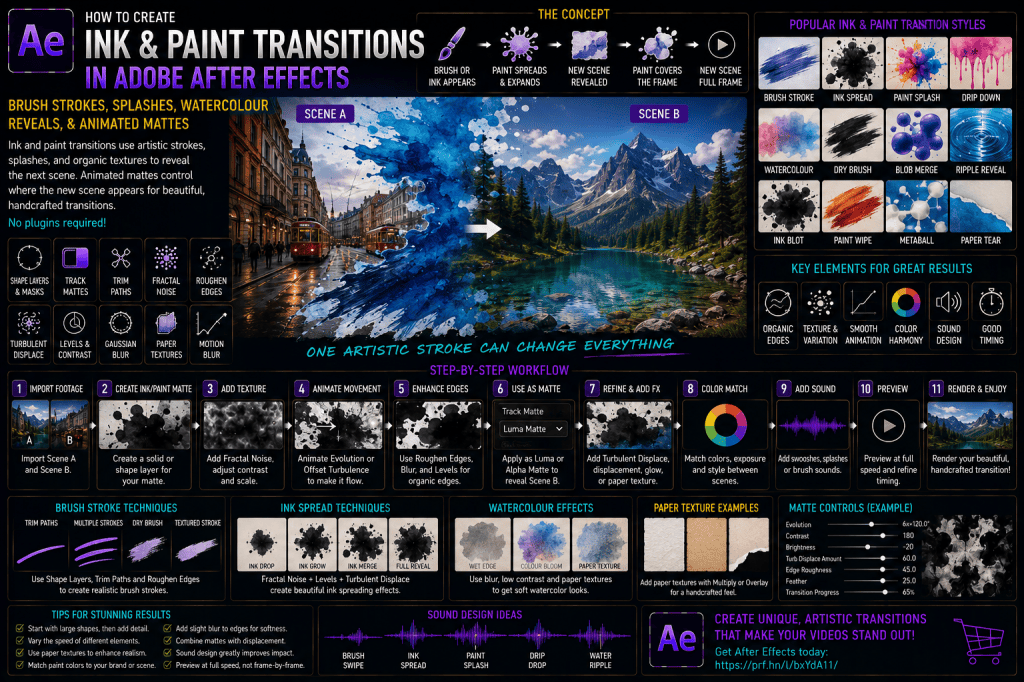
Ink and paint transitions can make a scene feel hand-crafted rather than digitally wiped from one shot to another.
A brush stroke can sweep across the frame and reveal a new scene.
Ink can spread outward organically until the next shot fills the composition.
Watercolor can bloom across textured paper.
Paint splashes can hit the screen and become transition mattes.
Drips can flow downward and uncover new footage.
These effects work especially well for:
- travel videos;
- creative portfolios;
- fashion;
- art and design content;
- music videos;
- documentaries;
- wedding films;
- product videos;
- social-media edits;
- title sequences;
- handmade-style motion graphics.
In Adobe After Effects, you can create these transitions with native tools such as:
- Shape Layers;
- masks;
- Track Mattes;
- Fractal Noise;
- Turbulent Displace;
- Roughen Edges;
- Trim Paths;
- Brush Stroke effects;
- Gaussian Blur;
- Levels;
- Displacement Map;
- paper textures;
- Motion Blur.
The basic structure is:
Scene A → ink or paint appears → matte expands → Scene B revealed → paint covers frame → Scene B remains
This tutorial covers clean brush wipes, watercolor blooms, paint splashes, ink spreads, dripping transitions, and hand-painted mattes.
Affiliate disclosure: This article contains affiliate links. If you purchase Adobe After Effects through one of these links, we may earn a commission at no additional cost to you.
Ink Transition vs Liquid Transition
Ink and paint transitions share some techniques with liquid transitions, but the visual goal is different.
A liquid transition emphasizes:
flow.
refraction.
distortion.
fluid movement.
An ink or paint transition emphasizes:
texture.
brush character.
splashes.
paper interaction.
organic edges.
visible artistic medium.
That means the matte itself often remains visually present rather than disappearing completely into a transparent effect.
If you’d like to follow along, you can explore Adobe’s current After Effects options here:
Explore Adobe After Effects and current plans
The Three-Layer Structure
Most ink transitions can be organized as:
SCENE_A
INK_MATTE
SCENE_B
The matte determines where Scene B is visible.
White areas:
reveal Scene B.
Black areas:
hide Scene B.
The same setup works with:
paint.
watercolor.
brush strokes.
splashes.
drips.
Project 1 — Basic Brush Stroke Reveal
Let’s begin with a simple painted wipe.
Step 1: Create the Composition
Create:
INK_PAINT_TRANSITION_MASTER
Suggested settings:
1920 × 1080.
30 fps.
10 seconds.
Import:
SCENE_A
and:
SCENE_B
Place Scene B above Scene A.
Step 2: Create a Shape Layer
Create:
BRUSH_MATTE
Use the Pen Tool.
Draw a curved path across the frame.
Step 3: Add Stroke
Inside the Shape Layer:
Add:
Stroke
Increase Stroke Width significantly.
For example:
200–400 px
depending on composition size.
Use:
Round Caps.
Step 4: Add Trim Paths
Choose:
Add → Trim Paths
Animate:
End:
0% → 100%.
The stroke now paints itself across the frame.
Step 5: Use as Track Matte
Use BRUSH_MATTE as:
Alpha Matte
for Scene B.
Now Scene B appears where the brush stroke travels.
Project Result
Scene A visible.
Brush stroke enters.
Scene B appears inside stroke.
Stroke continues.
Scene B gradually replaces Scene A.
PART 2 — MAKE THE BRUSH EDGE ORGANIC
A perfect digital Stroke doesn’t look painted.
Apply:
Roughen Edges
Step 6: Adjust Border
Increase:
Border.
Step 7: Adjust Scale
Change:
Scale
until the edge looks irregular.
Step 8: Animate Evolution
Animate:
Evolution.
The painted edge shifts slightly as it travels.
Project 2 — Textured Brush Wipe
Use:
Shape Stroke.
Trim Paths.
Roughen Edges.
Scene B should appear through a less-perfect, more painterly boundary.
PART 3 — MULTIPLE BRUSH STROKES
A single giant brush stroke may feel artificial.
Create several:
BRUSH_01
BRUSH_02
BRUSH_03
BRUSH_04
Offset them in time.
Step 9: Vary Stroke Width
For example:
Stroke 1:
220 px.
Stroke 2:
160 px.
Stroke 3:
260 px.
Stroke 4:
120 px.
This creates variation.
Step 10: Vary Direction
Not every stroke needs to move identically.
Try:
left → right.
slightly diagonal.
curved.
Project 3 — Multi-Stroke Paint Reveal
Several brush strokes sweep across the composition.
Each reveals more of Scene B.
Eventually Scene B fills the screen.
PART 4 — BRUSH TEXTURE
To make strokes look more authentic:
add texture.
Options include:
Fractal Noise.
paper texture.
scanned brush texture.
grain.
Step 11: Add Fractal Noise
Apply subtle Fractal Noise to the brush matte.
Use:
Multiply.
Luma Matte.
or displacement depending on the setup.
Step 12: Break Up the Stroke
The texture can create:
thin gaps.
paint variation.
rough edges.
PART 5 — PAINT DRY-BRUSH EFFECT
A dry brush doesn’t create a perfectly solid stroke.
It leaves:
gaps.
streaks.
texture.
Use Fractal Noise to subtract parts of the matte.
Project 4 — Dry Brush Transition
Scene B appears in fragmented brush streaks.
Additional strokes complete the reveal.
PART 6 — INK SPREAD
Now let’s create an ink-blot transition.
Step 13: Create Solid
Create:
INK_MATTE
Apply:
Fractal Noise.
Step 14: Increase Contrast
Create large black-and-white regions.
Step 15: Lower Brightness Initially
Start with mostly black.
Step 16: Animate Brightness or Levels
Gradually reveal more white areas.
This creates the appearance of ink spreading.
Step 17: Add Turbulent Displace
Apply:
Turbulent Displace.
Animate:
Evolution.
Project 5 — Growing Ink Blot
Small irregular ink region appears.
Spreads.
Branches.
Merges.
Scene B becomes visible inside.
Eventually the matte fills the frame.
PART 7 — MULTIPLE INK BLOBS
Create several ink sources.
Start them at different positions.
For example:
top-left.
center.
bottom-right.
Step 18: Offset Timing
Blob 1 starts.
Blob 2 follows.
Blob 3 begins later.
They eventually merge.
PART 8 — METABALL INK
Use multiple Shape Layer circles.
Blur them.
Apply Levels.
This causes them to merge into organic forms.
Project 6 — Ink Spots Merge
Several ink drops spread across paper.
They touch.
Merge.
Reveal Scene B.
PART 9 — INK SPLASH
A splash transition should feel more explosive.
Use multiple irregular shapes.
Step 19: Create Main Splash
Create:
large central blob.
Step 20: Add Smaller Drops
Add:
small circles.
elongated droplets.
tiny specks.
Step 21: Animate Scale
Main splash:
0% → 110%.
Drops:
0% → different sizes.
Step 22: Offset Positions
Animate some droplets outward.
Project 7 — Paint Splash Reveal
Splash hits.
Main shape expands.
Droplets fly outward.
Scene B appears.
PART 10 — RADIAL SPLASH
Use the center of the frame as impact point.
Create:
main blot.
radial droplets.
streaks.
This works well for:
logos.
music videos.
sports.
fashion.
PART 11 — SIDE SPLASH
A splash can enter from outside the frame.
For example:
left → right.
Useful when the transition needs directional energy.
PART 12 — WATER-COLOR BLOOM
Watercolor spreads more softly than ink.
Use:
Fractal Noise.
Blur.
Levels.
very soft edges.
Step 23: Increase Blur
Watercolor should not have crisp boundaries.
Step 24: Add Low-Contrast Texture
Avoid pure black/white matte until final Track Matte stage.
The visible paint itself can retain softer opacity variation.
Step 25: Add Paper Texture
Place a textured paper layer above or below the watercolor.
Use:
Multiply.
Overlay.
or soft blending.
Project 8 — Watercolor Reveal
White or textured background.
Watercolor color appears.
Blooms outward.
Scene B becomes visible inside the painted area.
PART 13 — WATERCOLOR EDGE
Apply:
Roughen Edges
with subtle settings.
Then:
Blur.
This creates a soft irregular boundary.
PART 14 — PIGMENT VARIATION
Real watercolor has darker pigment near some edges.
Duplicate the matte.
Create a darker rim.
Use:
Find Edges.
Levels.
Glow.
or thin masks.
Keep it subtle.
PART 15 — WATERCOLOR BLEED
Animate soft secondary shapes slightly beyond the main edge.
This simulates pigment bleeding into paper.
Project 9 — Artistic Watercolor Transition
Soft color bloom.
paper texture.
darker pigment edge.
secondary bleed.
Scene B gradually appears.
PART 16 — PAINT DRIP TRANSITION
Paint can drip vertically.
Create several vertical Shape Layers.
Step 26: Draw Drips
Use:
rounded rectangles.
circles.
custom paths.
Step 27: Animate Downward
Animate:
Scale Y.
Position Y.
or Shape Path.
Step 28: Vary Length
Some drips move farther.
Some stop earlier.
Project 10 — Dripping Paint Reveal
Paint appears at top.
Drips descend.
Scene B appears behind.
Eventually paint coverage becomes complete.
PART 17 — INK DRIP
For black ink:
use thinner drips.
irregular speed.
Turbulent Displace.
PART 18 — BLOOD-LIKE DRIP
The same technique can create darker dramatic fluid styles, but color and context determine whether it reads as ink, paint, or something else.
For general-purpose motion graphics, keep the interpretation clearly artistic.
PART 19 — BRUSH SWIPE TRANSITION
Create one fast diagonal brush stroke.
Use:
Trim Paths.
Motion Blur.
Roughen Edges.
Scene B appears rapidly.
This is excellent for:
short-form video.
sports.
music.
Project 11 — Fast Brush Swipe
Brush crosses in:
8–12 frames.
Scene B is revealed.
A secondary small splash adds energy.
PART 20 — BRUSH STROKE WITH VISIBLE COLOR
The matte does not need to be invisible.
Create two versions:
BRUSH_COLOR
BRUSH_MATTE
The visible colored stroke travels first.
Scene B is revealed slightly behind it.
This creates a layered wipe.
Example
Purple brush enters.
100 ms later:
Scene B follows.
The brush behaves like a transition leader.
PART 21 — MULTI-COLOR BRUSH TRANSITION
Use brand colors.
For example:
purple.
blue.
orange.
Animate several brush layers in succession.
Scene B appears behind the final stroke.
Project 12 — Branded Paint Wipe
Color 1 sweeps.
Color 2 follows.
Color 3 follows.
Scene B appears.
This works well for:
corporate intros.
YouTube channels.
social branding.
PART 22 — PAINT STREAK TRANSITION
Create long narrow brush marks.
Animate horizontally.
Use multiple vertical offsets.
PART 23 — HAND-PAINTED MATTE
If you have an actual scanned paint stroke:
import it.
Use:
Luma Matte.
Animate:
Scale.
Position.
Masks.
This often looks more authentic than a fully procedural brush.
PART 24 — SCANNED INK TEXTURES
Photograph or scan:
ink splashes.
paint strokes.
watercolor marks.
Use Levels to create:
high-contrast mattes.
This is a strong way to add real texture.
PART 25 — FRAME-BY-FRAME PAINT
For a handmade aesthetic:
draw several paint frames.
Sequence them.
Use as an animated matte.
This can produce very organic results.
PART 26 — WRITE-ON EFFECT
Use:
Write-on
or Shape Layer Stroke animation
to reveal the matte along a path.
Project 13 — Signature Paint Reveal
Handwritten stroke moves across screen.
Scene B appears along the writing path.
PART 27 — TEXT REVEAL WITH PAINT
Use the paint as a matte for:
title.
headline.
logo.
Step 29: Place Text
Create:
TITLE
Step 30: Use Paint Matte
Reveal text through:
brush strokes.
ink spread.
watercolor.
PART 28 — TEXT-TO-SCENE TRANSITION
First reveal a word.
Then enlarge the paint matte.
Transition into Scene B.
Project 14 — Painted Title to Footage
Brush writes:
TRAVEL.
Paint grows around word.
Landscape appears.
Landscape fills frame.
PART 29 — LOGO PAINT REVEAL
Use brush textures to reveal:
logo.
Then extend the paint to reveal the next scene.
PART 30 — PRODUCT PAINT TRANSITION
Use a product’s brand color.
Paint splashes behind or over the product.
Then becomes the scene transition.
PART 31 — BEAUTY AND FASHION STYLE
Use:
soft watercolor.
pastel colors.
slow brush strokes.
paper textures.
PART 32 — SPORTS STYLE
Use:
fast splashes.
hard brush edges.
bold colors.
strong whoosh.
PART 33 — MUSIC VIDEO STYLE
Use:
high contrast ink.
multiple splashes.
distortion.
chromatic color.
PART 34 — DOCUMENTARY STYLE
Use:
subtle ink.
paper texture.
slower timing.
restrained color.
PART 35 — MAP INK REVEAL
Maps work especially well with ink.
Example:
world map.
ink spreads over a region.
new location footage appears.
Project 15 — Map-to-Destination Paint Transition
Map visible.
brush circles location.
ink expands.
destination footage appears.
PART 36 — PHOTO COLLAGE TRANSITION
Use brush strokes to reveal multiple photographs.
This works well for:
travel.
weddings.
history.
portfolio reels.
PART 37 — SCRAPBOOK STYLE
Combine:
paper textures.
torn edges.
brush strokes.
handwritten text.
ink splashes.
PART 38 — ROUGHEN EDGES
Roughen Edges is one of the most useful native effects for stylized paint mattes.
Adjust:
Border.
Edge Sharpness.
Fractal Influence.
Scale.
Complexity.
Avoid Too Much Detail
Very high complexity can create noisy edges.
For a clear transition:
keep larger readable forms.
PART 39 — TURBULENT DISPLACE
Use it when you want:
flowing.
uneven.
moving edges.
Animate:
Evolution.
PART 40 — FRACTAL NOISE
Use it for:
ink textures.
paint gaps.
watercolor variation.
splash mattes.
PART 41 — BLUR + LEVELS
This is especially useful for merging:
drops.
splashes.
blobs.
Create:
soft shapes.
Blur.
Then increase contrast with Levels.
The shapes appear to fuse.
PART 42 — DISPLACEMENT MAP
Use a paint or ink texture to distort the image slightly near the transition edge.
This creates stronger integration.
Step 31: Duplicate Ink Matte
Create:
INK_DISPLACE
Step 32: Apply Displacement Map
Use on Scene A and Scene B.
Keep distortion moderate.
Project 16 — Ink Distortion Transition
Ink spreads.
Image warps near ink.
Scene changes.
Distortion disappears.
PART 43 — PAPER TEXTURE
A paper texture helps sell:
watercolor.
ink.
brush.
traditional-art appearance.
Use subtle Opacity.
Don’t overpower the footage.
PART 44 — PAPER GRAIN
Add:
Noise.
Film Grain.
high-frequency texture.
This helps the composited paint sit naturally on the background.
PART 45 — PAINT EDGE SHADOW
For thick paint:
add a subtle Drop Shadow.
This makes the paint appear physically above the paper or scene.
PART 46 — EDGE HIGHLIGHT
For wet paint:
add a slight bright edge.
Keep it minimal.
PART 47 — COLOR BLENDING
Experiment with:
Multiply.
Screen.
Overlay.
Soft Light.
Normal.
Different modes produce different paint behavior.
PART 48 — MATCH PAINT COLOR TO THE SCENE
A transition feels more integrated when the paint color relates to:
Scene A.
Scene B.
brand palette.
PART 49 — TRANSITION TIMING
Typical durations:
6–12 frames: fast brush swipe.
12–24 frames: energetic splash.
24–45 frames: smooth paint reveal.
1–2 seconds: watercolor bloom.
PART 50 — SPEED RAMPING
Fast splashes should:
accelerate quickly.
hit.
settle.
Brush strokes can use more even movement.
Watercolor should usually spread more slowly.
PART 51 — MOTION BLUR
Enable for:
fast brush movement.
splashes.
drips.
Avoid excessive blur on slow watercolor.
PART 52 — SOUND DESIGN
Sound should match the artistic medium.
Useful options:
brush swipe.
paint splash.
wet drip.
paper movement.
ink spread.
soft whoosh.
Brush Transition Sound
Use:
short textured swipe.
Splash Transition Sound
Use:
impact + splash.
Watercolor Sound
Use:
soft swish.
paper texture.
subtle ambience.
PART 53 — AUDIO BRIDGE
Begin Scene B sound before the reveal finishes.
This creates continuity.
PART 54 — BUILD A PAINT CONTROL NULL
Create:
PAINT_CTRL
Add:
Transition Progress.
Edge Roughness.
Paint Scale.
Feather.
Displacement.
Texture Strength.
Paint Color.
PART 55 — CREATE PRESETS
Build:
BRUSH WIPE
INK SPREAD
PAINT SPLASH
WATERCOLOR
DRIP
DRY BRUSH
MULTI-COLOR
MAP REVEAL
Recommended Project Organization
Create folders:
SCENE_A
SCENE_B
BRUSHES
INK
PAINT
PAPER
MATTES
ADJUSTMENTS
AUDIO
CONTROLS
Suggested Layer Stack
PAINT_HIGHLIGHT
VISIBLE_PAINT
SCENE_B
PAINT_MATTE
SCENE_A
PAPER_TEXTURE
PAINT_CTRL
AUDIO
Common Mistake: Brush Looks Too Perfect
Use Roughen Edges or real texture.
Common Mistake: Ink Looks Like Clouds
Increase contrast and create more defined growth.
Common Mistake: Watercolor Edge Is Too Hard
Use more Blur and softer opacity.
Common Mistake: Every Splash Appears Together
Stagger timing.
Common Mistake: Too Many Tiny Drops
Large recognizable shapes read better.
Common Mistake: Paint Color Doesn’t Fit
Use a coherent palette.
Common Mistake: Texture Is Too Strong
Keep paper and grain subtle.
Common Mistake: Matte Never Fully Covers Screen
Make sure the final reveal reaches every corner.
Common Mistake: Motion Is Too Linear
Add easing or irregular timing.
Common Mistake: Sound Doesn’t Match Medium
Choose brush, splash, drip, or paper sounds accordingly.
Basic Ink and Paint Transition Quick Recipe
- Import Scene A.
- Import Scene B.
- Create brush or ink matte.
- Add texture.
- Add Roughen Edges.
- Add Fractal Noise if needed.
- Animate matte.
- Use Track Matte.
- Reveal Scene B.
- Add Turbulent Displace.
- Add Blur where appropriate.
- Add Levels.
- Match colors.
- Add Motion Blur.
- Add paper texture.
- Add displacement if desired.
- Add sound.
- Preview.
- Refine.
- Render.
Brush Wipe Recipe
Use:
Shape Layer Stroke.
Trim Paths.
Roughen Edges.
Track Matte.
Ink Spread Recipe
Use:
Fractal Noise.
Levels.
Turbulent Displace.
animated threshold.
Paint Splash Recipe
Use:
Shape Layers.
Scale.
Position.
Motion Blur.
droplets.
Watercolor Recipe
Use:
Fractal Noise.
heavy Blur.
soft matte.
paper texture.
Drip Recipe
Use:
vertical Shape Layers.
Position.
Scale Y.
Turbulent Displace.
Dry Brush Recipe
Use:
Stroke.
Fractal Noise.
Luma Matte.
gaps and streaks.
Five Essential Ink and Paint Exercises
Exercise 1 — Brush Stroke Reveal
Learn Trim Paths and matte animation.
Exercise 2 — Ink Spread
Learn procedural growth.
Exercise 3 — Paint Splash
Learn layered Shape animation.
Exercise 4 — Watercolor Bloom
Learn soft texture and paper integration.
Exercise 5 — Paint-to-Scene Transition
Combine visible paint with the reveal matte.
Master these five techniques and you’ll understand the foundation of most artistic ink and paint transitions.
Frequently Asked Questions
Can I create ink transitions in After Effects?
Yes.
Use procedural mattes, Shape Layers, Track Mattes, Fractal Noise, and Turbulent Displace.
Can I create brush strokes?
Yes.
Shape Layer Strokes combined with Trim Paths are ideal for animated brush reveals.
How do I make a digital stroke look more like paint?
Use Roughen Edges, texture, Fractal Noise, and slight irregularity.
Can I create watercolor?
Yes.
Use soft procedural mattes, Blur, subtle color variation, and paper textures.
Can I create paint splashes?
Yes.
Build them from irregular Shape Layers or imported splash assets and animate Scale and Position.
Can I use real scanned ink?
Yes.
Scanned splashes and brush strokes can make very convincing matte assets.
Can I create dripping paint?
Yes.
Use Shape Layers, Scale, Position, and Turbulent Displace.
Can I reveal text with a brush?
Yes.
Use the animated brush layer as a matte for the text.
Can I use paint transitions with logos?
Yes.
They work particularly well in branded intros and product videos.
Do I need third-party plug-ins?
No.
The fundamental workflow can be created using native After Effects tools.
Practice Project: Watercolor Travel Transition
Create:
INK_PAINT_TRANSITION_MASTER
at:
1920 × 1080.
Import:
SCENE_A — City Street
SCENE_B — Mountain Lake
Create:
WATERCOLOR_MATTE
Use:
Fractal Noise.
Increase:
Scale.
Reduce:
Contrast slightly.
Apply:
Gaussian Blur.
Apply:
Levels.
Create large soft white regions.
Animate:
Brightness or Levels
so white areas gradually spread.
Apply:
Turbulent Displace.
Use low-to-moderate:
Amount.
Animate:
Evolution.
Use WATERCOLOR_MATTE as:
Luma Matte
for Scene B.
Create a visible watercolor layer using:
soft blue.
purple.
orange.
Place:
paper texture
over the composition.
Use:
Multiply
or another suitable blend.
Add:
subtle pigment variation.
Animate:
Scene B appearing inside watercolor bloom.
Eventually:
matte fills frame.
Fade visible watercolor slightly.
Mountain lake remains.
Add:
soft paper/brush sound.
Begin:
nature ambience
during the reveal.
The viewer should experience:
city street.
watercolor begins spreading.
mountain lake appears inside pigment.
paint grows across frame.
city disappears.
landscape remains.
That project teaches:
Fractal Noise,
soft mattes,
watercolor texture,
Turbulent Displace,
Track Mattes,
paper integration,
organic timing,
and:
audio bridging.
If you’d like to create these effects yourself, you can explore Adobe’s current After Effects options below:
What Should You Learn Next?
After ink and paint transitions, the next logical technique is creating glitch transitions.
Instead of organic media, we’ll move into digital distortion.
We’ll cover:
RGB splitting.
digital blocks.
signal noise.
pixel sorting style effects.
displacement.
scan lines.
frame tearing.
rapid distortion.
The next article will therefore be:
How to Create Glitch Transitions in Adobe After Effects: RGB Split, Digital Distortion, Signal Noise, and Frame Tearing.
Final Thoughts
Ink and paint transitions work because the transition itself becomes part of the visual design.
Instead of hiding the edit with blur or speed, you reveal the new scene through a medium the viewer can see.
A brush paints the scene into existence.
Ink spreads across the frame.
Watercolor blooms into the next location.
Paint drips downward.
Splashes explode outward.
The most convincing results usually combine three things:
a strong matte, believable texture, and appropriate timing.
Start simple.
Build one brush stroke.
Use it as a matte.
Then add texture.
Then add irregular edges.
Once that works, experiment with ink, watercolor, splashes, drips, maps, logos, and branded colors.
With those fundamentals, you can create a wide range of artistic transitions directly inside After Effects.
Explore Adobe After Effects and start creating professional ink and paint transitions