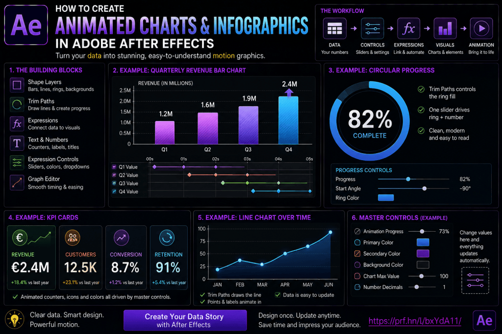
Animated charts can make otherwise static numbers far easier to understand.
Instead of showing a table full of values, Adobe After Effects lets you turn those values into motion.
A bar can grow from 0 to 75%.
A line chart can draw itself across the screen.
A circular progress ring can animate from 0 to 92%.
A number counter can rise alongside the chart.
Several KPI cards can appear one after another to build a complete dashboard.
These techniques are useful for:
- corporate videos;
- annual reports;
- financial presentations;
- YouTube videos;
- explainer videos;
- marketing content;
- social-media graphics;
- dashboards;
- business reviews;
- educational videos.
And you don’t need specialized data-visualization software to get started.
After Effects already provides the essential tools:
Shape Layers
Trim Paths
Text Layers
Expressions
Expression Controls
Graph Editor
In this guide, we’ll build several common animated data visualizations and show how expressions can keep numbers and graphics synchronized automatically.
Affiliate disclosure: This article contains affiliate links. If you purchase Adobe After Effects through one of these links, we may earn a commission at no additional cost to you.
What Is an Animated Infographic?
An infographic combines information and visual design to communicate data quickly.
An animated infographic adds motion.
For example, instead of showing:
Conversion Rate: 72%
you could show:
72%
inside a circular ring that fills to exactly 72%.
Instead of showing:
Revenue
Q1: €1.2M
Q2: €1.6M
Q3: €1.9M
Q4: €2.4M
you could animate four bars growing to different heights.
Motion gives the viewer a visual representation of the numbers.
Why Animate Data?
Animation can help:
- establish hierarchy;
- direct attention;
- compare values;
- reveal trends;
- explain change over time;
- make statistics more memorable.
But animation should clarify the data rather than distract from it.
That’s the most important principle throughout this tutorial.
The Basic Data-Animation Workflow
Most After Effects data graphics follow this structure:
Data value
↓
Control
↓
Expression
↓
Visual property
For example:
75
↓
Slider Control
↓
linear()
↓
Bar height = 75%
The same Slider might also control the displayed text:
75%
Now the chart and number remain synchronized automatically.
Why Use Expression Controls?
You could animate everything manually.
But Expression Controls provide one central value.
For example:
Sales = 68
That value can control:
- bar height;
- number counter;
- color;
- label position.
Change:
68
to:
Everything updates.
This is especially useful when you need to revise the data later.
If you’d like to practice these data-animation techniques yourself, you can explore Adobe’s current After Effects options here:
Explore Adobe After Effects and current plans
Project 1: Animated Percentage Bar
Let’s start with the simplest possible chart.
We’ll create a horizontal bar representing:
72%
Step 1: Create the Background Bar
Create a Shape Layer.
Add a rectangle.
Make it a muted background color.
This represents:
100%.
Rename the layer:
BAR BG
Step 2: Create the Animated Bar
Duplicate the rectangle or create another Shape Layer.
Place it directly over the background.
Rename it:
BAR VALUE
Give it a more prominent Fill color.
Step 3: Set the Anchor Point
If you animate Scale X, the bar should grow from:
left → right
not from the center.
Move the Anchor Point to the left side of the bar.
Now scaling horizontally will preserve the left edge.
Step 4: Animate Scale X
Set the Scale values so Y remains:
100%
while X animates:
0 → 72%.
You now have a basic animated percentage bar.
Better: Add a Slider Control
Create a Null:
CTRL — CHART
Add:
Value
Slider Control.
Set:
Now connect the BAR VALUE Scale X to the Slider.
Conceptually:
Slider 72
↓
Scale X 72%
The bar now represents whatever number the Slider contains.
Add a Percentage Counter
Create a Text Layer.
Use the animated number-counter technique from the previous article.
Connect Source Text to the same:
Value
Slider.
Add:
%
Now:
Value = 72
produces:
Bar = 72%
and:
Text = 72%
One control drives both graphics.
Animate the Slider Instead
Rather than animating Scale directly, animate:
Value Slider
from:
0
to:
Now both the bar and counter animate together.
This is a cleaner setup.
Use Easy Ease
Apply Easy Ease to the Value Slider keyframes.
Then use the Graph Editor to refine the timing.
Because all related properties read the same Slider, they automatically share the same animation timing.
Add a Label
Create another Text Layer:
Customer Satisfaction
Place it beside or above the bar.
Now your graphic contains:
Label
Animated bar
Animated percentage
This is the foundation of many infographic designs.
Project 2: Vertical Bar Chart
Next, let’s create a basic four-column bar chart.
Suppose the values are:
Q1 — 35
Q2 — 52
Q3 — 68
Q4 — 84
Step 1: Create One Bar
Create a rectangle Shape Layer.
Set its Anchor Point at the bottom.
This lets Scale Y grow upward.
Step 2: Duplicate the Bar
Create four copies.
Rename them:
BAR Q1
BAR Q2
BAR Q3
BAR Q4
Space them evenly.
Step 3: Create Four Slider Controls
On the chart-control Null, add:
Q1 Value
Q2 Value
Q3 Value
Q4 Value
Set:
35
52
68
84
Step 4: Connect Each Bar
Each bar’s Scale Y reads its corresponding Slider.
Now changing:
Q3 Value
automatically changes the Q3 bar.
Animate the Values
Set each Slider to:
0
at the beginning.
Then animate to its target value.
For example:
Q1 → 35
Q2 → 52
Q3 → 68
Q4 → 84
Now all bars grow.
Stagger the Bars
Instead of making all four start simultaneously:
Q1 starts first.
Q2 starts three frames later.
Q3 follows.
Q4 follows.
This makes the chart easier to read.
Use the Graph Editor
Refine the animation so bars:
- accelerate smoothly;
- slow as they reach their values.
Avoid extremely springy motion unless it fits the visual style.
Data graphics usually benefit from clean movement.
Add Value Labels
Place a Text Layer above each bar.
Each number reads the same Slider controlling the bar.
For example:
Q1 bar:
35
and:
Q1 label:
35
These remain synchronized.
Position Labels Automatically
You can make the label follow the top of the bar.
Conceptually:
Bar height changes
↓
Label Y position follows bar top
This eliminates the need for separate Position keyframes.
Why This Matters
If Q1 changes from:
35
to:
60,
the bar becomes taller.
The label automatically moves upward.
The entire chart updates from one data value.
Project 3: Circular Percentage Ring
Circular progress indicators are extremely popular.
Let’s create:
82%
inside a ring.
Step 1: Create a Circle
Create a Shape Layer using the Ellipse Tool.
Remove Fill.
Add a Stroke.
Step 2: Add Trim Paths
Inside the Shape Layer:
Add → Trim Paths
Locate:
End
This controls how much of the circular stroke is visible.
Step 3: Connect Trim Paths to a Slider
Create:
Progress
Slider.
Set:
Connect:
Trim Paths → End
to:
Progress
Now the ring shows:
82%.
Step 4: Add the Number
Create a centered Text Layer.
Link it to:
Progress
and add:
%
Now one Slider controls:
Ring
and:
Percentage Text
Animate 0 to 82
Animate Progress:
0 → 82.
The ring fills while the number counts upward.
This is one of the cleanest examples of expression-driven infographic animation.
Add a Background Ring
Duplicate the circle.
Remove Trim Paths.
Give it a muted Stroke.
Place it beneath the animated ring.
Now viewers can clearly see the full 100% range.
Rotate the Start Point
By default, a circle’s Trim Paths animation may begin from a location you don’t prefer.
You can rotate the Shape Layer or adjust the path orientation so it starts at:
12 o’clock
which is often more intuitive for progress rings.
Project 4: Animated Line Chart
Line charts are useful for showing trends over time.
Suppose your data represents:
Jan → 20
Feb → 35
Mar → 31
Apr → 55
May → 72
Step 1: Draw the Line
Use the Pen Tool to create a Shape Layer path through several data points.
Add a Stroke.
Remove Fill.
Step 2: Add Trim Paths
Add:
Trim Paths
Animate:
End 0% → 100%.
The chart line draws itself across the screen.
Step 3: Use Easy Ease Carefully
A line chart represents a sequence over time.
A simple smooth reveal usually works well.
Avoid bounce or overshoot that could imply values not represented by the actual data.
Add Data Points
Create small circles at each chart point.
You can animate their Scale:
0 → 100%.
Stagger them so each appears as the line reaches that point.
Add Labels
Each point can have:
- date;
- value;
- category.
For example:
May
72
Keep the visual hierarchy simple.
Animate Data Point Values
If the numerical labels need to count upward, use a Slider Control for each data point.
The number animation can finish as the corresponding point appears.
Line Chart Grid
Add horizontal and vertical grid lines if they improve readability.
Use low visual contrast.
The data line should remain dominant.
Project 5: KPI Card
KPI cards are common in business dashboards.
A card might display:
€1.25M
Annual Revenue
+18.4%
Let’s create one.
Build the Card
Create:
Background Shape
Large Counter
Metric Label
Trend Indicator
Optionally add:
- icon;
- accent color;
- mini chart.
Animate the Number
Use the number-counter setup.
Slider:
0 → 1,250,000.
Format it as:
€1.25M
or:
€1,250,000
depending on the design.
Animate the Trend
Use a second Slider:
Growth
Set:
18.4.
Display:
+18.4%
Add an upward arrow.
Color Based on Positive or Negative Growth
You can use conditional logic.
Conceptually:
If Growth >= 0:
use positive color.
Otherwise:
use negative color.
This allows the KPI card to update visually with the data.
Create Four KPI Cards
Examples:
Revenue
€1.25M
Customers
12,450
Conversion
8.7%
Retention
91%
Each card can use the same structure.
Only the data changes.
Build One Card, Duplicate It
This is more efficient than designing each from scratch.
Use consistent:
- padding;
- typography;
- corner radius;
- animation.
Your infographic becomes visually coherent.
Project 6: Donut Chart
A donut chart can show multiple categories.
Suppose:
Product A — 45%
Product B — 30%
Product C — 25%
You can construct three arc segments.
Use Separate Shape Layers
Create one circular Stroke for each category.
Use Trim Paths to control:
- segment length;
- segment offset.
This requires more careful calculation than a single progress ring.
Keep Donut Charts Simple
Too many categories become difficult to distinguish.
For motion graphics, 3–5 categories are often easier to understand than 15.
Animate Each Segment
You can:
- animate sequentially;
- animate all simultaneously;
- reveal them clockwise.
Sequential animation often makes category proportions easier to follow.
Add a Legend
Include:
Color
Category
Value
For example:
Product A — 45%
Product B — 30%
Product C — 25%
Don’t rely on color alone.
Labels improve accessibility and clarity.
Project 7: Comparison Chart
Suppose you want to compare:
2025 Revenue — €1.5M
with:
2026 Revenue — €2.1M
Create two bars.
Use a common scale.
Animate them side by side.
Avoid Misleading Scales
Data visualization has an ethical component.
If two bars represent:
90
and:
100,
but one appears three times taller than the other because the axis begins at 85, the graphic may exaggerate the difference.
Use scales deliberately and transparently.
Data Accuracy Matters More Than Drama
Animation should make the data clearer.
It should not distort the meaning.
Avoid:
- arbitrary bar heights;
- inconsistent scales;
- exaggerated perspective;
- misleading area comparisons.
Map Data Values to Pixels
Sometimes your value is:
72
but the chart area is:
500 pixels tall.
You need to map:
0–100
to:
0–500.
This is where:
linear()
becomes useful.
Example Mapping
Conceptually:
linear(value,0,100,0,500)
Now:
0 → 0 px
50 → 250 px
100 → 500 px
This lets you convert numerical data into visual dimensions.
Mapping Arbitrary Data Ranges
Suppose sales range from:
€1,000
to:
€10,000.
Your chart height is:
400 pixels.
Map:
1000–10000
to:
0–400.
This creates proportional visual scaling.
Use a Maximum Value Control
A reusable chart should ideally have:
Maximum Value
as a control.
Then your bars can calculate their size relative to that value.
For example:
Bar Value:
750
Max:
1000
Visual height:
75%.
Why Max Value Is Important
Without a common maximum, different bars may use inconsistent scales.
A master maximum maintains meaningful comparisons.
Master Progress Control
A particularly useful technique is creating:
Animation Progress
Slider:
0–100.
Instead of keyframing every chart separately, use one progress value.
How It Works
Suppose Q1 target value is:
At Progress:
0%
the displayed value is:
At Progress:
50%
the displayed value becomes approximately:
17.5.
At:
100%
the value reaches:
Use:
linear(progress,0,100,0,targetValue)
for each metric.
One Slider Animates the Entire Dashboard
You can now animate:
Progress 0 → 100
and:
- bars grow;
- counters increase;
- rings fill;
- KPI values animate.
This dramatically simplifies complex infographic timelines.
Add Staggering
If everything begins simultaneously, the dashboard may feel overwhelming.
Introduce delays.
For example:
Revenue starts at 0%.
Customers begins after progress reaches 10%.
Conversion begins after 20%.
Retention after 30%.
You can calculate these offsets mathematically.
Build Visual Hierarchy
Data animation should guide the eye.
A useful sequence might be:
- Headline appears.
- Primary KPI animates.
- Supporting bars grow.
- Trend line draws.
- Labels appear.
This is more readable than having every element animate at once.
Create an Animated Infographic Timeline
Infographics can also represent chronological events.
For example:
2022 — Company founded
2023 — 1,000 customers
2024 — International expansion
2025 — €5M revenue
2026 — 50,000 users
Use:
- line;
- milestones;
- icons;
- counters.
Trim Paths can reveal the timeline progressively.
Animate a Timeline Line
Create a Shape Layer line.
Add Trim Paths.
Animate:
0 → 100%.
As the line moves forward, reveal each milestone.
This creates a clear narrative structure.
Use Markers for Timing
Composition markers can help identify moments when each data point should appear.
This makes complex infographic timing easier to manage.
Chart Labels
Every chart should clearly communicate:
- what the value represents;
- unit;
- category;
- time period.
Avoid presenting beautiful bars with no context.
Show Units
Examples:
€
%
kg
ms
hours
users
Numbers without units can be ambiguous.
Use Consistent Number Formatting
If one card displays:
€1.2M
and another:
€1,250,000.00
the dashboard may feel inconsistent.
Define a formatting standard.
Decimal Precision
Use only the precision necessary.
For example:
8.4%
may be enough.
Displaying:
8.43762%
usually adds visual noise without useful information.
Color Strategy
Use color to reinforce meaning.
For example:
Primary metric:
strong accent.
Supporting metrics:
more restrained colors.
Positive trend:
appropriate positive signal.
Negative trend:
appropriate warning signal.
But don’t rely on color alone to communicate meaning.
Accessibility
Consider viewers with color-vision differences.
Use:
- labels;
- icons;
- patterns;
- positioning;
- text.
Don’t make red and green the only way to distinguish outcomes.
Contrast
Data text must remain readable.
Ensure sufficient contrast between:
- numbers;
- backgrounds;
- chart elements;
- footage.
Font Choice
For numerical graphics, fonts with clear numerals are important.
Look for:
- distinct 1 and 7;
- clear decimal points;
- readable percentage signs;
- consistent number widths where useful.
Tabular Numbers
Some fonts support tabular figures, where each digit occupies equal width.
This is excellent for animated counters because the text changes without constantly shifting horizontally.
When Proportional Numbers Are Fine
For large headline statistics, proportional figures can still look excellent.
Test the actual animation.
Add Responsive Backgrounds
Use the sourceRectAtTime() technique from the previous articles.
A KPI card or label can automatically resize around:
€1.2M
or:
€10,250,000
without manual resizing.
Responsive Dashboard Cards
Combine:
Number counter
Label
responsive Shape Layer
Expression Controls
Now each card adapts to different content.
Add Master Colors
Create a controller layer:
CTRL — INFOGRAPHIC
Add:
Primary Color
Secondary Color
Positive Color
Negative Color
Background Color
All charts can reference these values.
Add Global Animation Speed
Create:
Animation Duration
or:
Animation Progress
depending on the system.
This lets you change the infographic pacing without editing dozens of keyframes.
Build a Reusable Infographic Template
A robust project might contain:
CTRL — INFOGRAPHIC
TITLE
KPI 01
KPI 02
KPI 03
BAR CHART
LINE CHART
FOOTNOTE
Organize each chart inside its own pre-comp.
Why Pre-Compose Charts?
Pre-compositions help isolate complex systems.
For example:
BAR CHART COMP
contains:
- bars;
- labels;
- values.
The main composition only needs one bar-chart layer.
This keeps the Timeline manageable.
Name Your Layers Clearly
Use:
BAR — REVENUE
rather than:
Shape Layer 17
Use:
VALUE — Q1
rather than:
Text 24
Data projects become complicated quickly.
Naming matters.
Keep Controls Separate from Artwork
A good structure is:
CTRL
contains values and configuration.
Artwork
contains visible elements.
ANIM
contains entrance/exit transforms.
This makes the system easier to troubleshoot.
Avoid Hard-Coded Numbers
If a value may change later, expose it as a Slider.
Instead of burying:
72
inside an expression, use:
Conversion Rate = 72
Now updating the data doesn’t require editing code.
Add a Data Notes Layer
For client work, consider adding a guide or notes layer describing:
- data source;
- date;
- units;
- chart maximum.
This reduces errors during revisions.
Keep Source Data
Always keep the source numbers documented.
Animation shouldn’t become the only place where the data exists.
Data-Driven Workflows
After Effects can go further than manually entered Slider Controls.
More advanced projects can use imported data such as:
- JSON;
- CSV-derived workflows;
- external data sources.
Expressions can then drive visual elements from that information.
When External Data Is Useful
Suppose you have:
100 chart values.
Manually entering each Slider is inefficient.
A data-driven workflow can be more appropriate.
For a simple five-value infographic, manual controls may be easier.
Choose complexity based on scale.
Don’t Overengineer Simple Charts
If you only need one 60% ring for one project, you don’t need a massive automated framework.
Expressions should save time, not become a programming exercise.
Motion Design Principles Still Matter
Automation doesn’t create good design automatically.
Pay attention to:
- hierarchy;
- spacing;
- timing;
- typography;
- contrast;
- composition.
A perfectly automated chart can still be visually poor.
Timing Charts
A common mistake is making every chart animate too slowly.
Most business infographic elements can reveal their information within:
0.5–1.5 seconds.
Longer animation may be appropriate for explanatory sequences.
Hold the Final Value
Give viewers enough time to read the result.
Don’t animate:
0 → 100
and immediately remove the graphic.
Allow a hold.
Animate Out
Your infographic also needs a clean exit.
Options include:
- fade;
- slide;
- collapse;
- reverse animation.
Keep the exit simpler than the information reveal in many cases.
Motion Blur
Use Motion Blur for moving:
- cards;
- bars sliding into place;
- labels.
Scale-based bar growth may not always require strong motion blur.
Judge visually.
Avoid Bounce on Accurate Charts
A bar representing:
75
should probably not overshoot to:
90
and bounce back to:
75,
because this temporarily communicates the wrong value.
This is important.
Physics-inspired animation is excellent for decorative graphics.
But data values should remain semantically accurate.
Better Alternative
Use easing.
Let the bar approach 75 smoothly without exceeding it.
Number Counters Can Ease
Counters can speed up and slow down.
They should generally not overshoot their target unless the temporary incorrect number has an intentional meaning.
Data Visualization Has Semantic Motion
Motion itself can communicate information.
An overshoot isn’t merely decorative when attached to a number.
It can imply the value temporarily exceeded the target.
Be careful.
Common Mistake: Bars Don’t Match Numbers
If the text says:
72%
but the bar visually represents:
65%,
the infographic loses credibility.
Use one data source to drive both.
Common Mistake: Different Scales
All bars in the same comparison chart should use the same scale unless explicitly stated otherwise.
Common Mistake: Overly Complex Animation
The audience is trying to understand the numbers.
Don’t bury them under:
- excessive particles;
- spinning elements;
- lens flares;
- constant camera movement.
Common Mistake: Too Many Colors
Use a controlled color system.
Common Mistake: Tiny Labels
Charts displayed on video often need larger typography than charts designed for desktop reports.
Common Mistake: Too Much Data
A 10-second animation probably shouldn’t show 50 statistics.
Break complex information into scenes.
Common Mistake: No Context
Always explain what:
72
actually means.
Common Mistake: No Source or Date
For important business or research data, consider showing:
- reporting period;
- data source.
Five Infographic Exercises
Exercise 1 — Percentage Bar
Create one bar and counter driven by the same Slider.
Exercise 2 — Four-Bar Chart
Create four bars with independently controlled values.
Exercise 3 — Progress Ring
Use Trim Paths and a percentage counter.
Exercise 4 — KPI Card
Create a counter, label, and trend indicator.
Exercise 5 — Dashboard
Combine three or more components using one master animation Progress Slider.
Complete these five and you’ll have a strong foundation for animated data visualization.
Practical Project: Business Performance Dashboard
Create four KPI cards:
Revenue
€2.4M
Growth
+18%
Customers
12.5K
Retention
92%
Below them, add a four-column quarterly revenue chart.
Animate the dashboard in stages.
Suggested Sequence
0:00
Title appears.
0:10
Revenue animates.
0:15
Other KPIs appear.
0:25
Bars grow.
0:40
Labels settle.
0:50
Hold complete dashboard.
This creates a clear information hierarchy.
Practical Project: Social Media Statistic
Create a vertical composition.
Large central value:
87%
Circular progress ring.
Text:
of customers prefer video tutorials
Animate:
- ring;
- number;
- supporting text.
Keep everything large enough for mobile viewing.
Practical Project: YouTube Subscriber Milestone
Create:
0 → 100K
counter.
Add:
- progress bar;
- channel icon;
- celebratory background animation.
Keep the actual number as the primary visual element.
Practical Project: Financial Chart
Animate:
- Revenue;
- Profit;
- Growth.
Use consistent colors and scales.
Add a footnote indicating the reporting period.
For financial content, clarity should dominate over decoration.
Frequently Asked Questions
Can After Effects create animated charts?
Yes. Shape Layers, Text Layers, Trim Paths, expressions, and Expression Controls can be combined to create many chart types.
Can I create bar charts?
Yes.
Can I create line charts?
Yes. Shape paths and Trim Paths work particularly well for animated line charts.
Can I create circular progress charts?
Yes. Use an Ellipse Stroke with Trim Paths.
Can numbers stay synchronized with charts?
Yes. Use one Slider Control to drive both the chart property and Source Text.
What is the best way to animate a percentage bar?
A Slider controlling horizontal Scale is a simple and effective method.
How do I animate chart values?
Animate a Slider Control and link visual properties to it.
Can I create an animated dashboard?
Yes. Multiple chart components and KPI cards can be combined into a single composition.
Can one Slider animate several metrics?
A master Progress Slider can drive several values using linear() or related mapping functions.
Can I import data?
Advanced After Effects workflows can use external data, though simple charts may be faster to build with Expression Controls.
Should charts use bounce animation?
Usually not when bouncing causes the visual value to temporarily exceed the real data. Smooth easing is generally safer.
Can I animate financial statistics?
Yes. Counters, bars, line charts, and KPI cards are commonly used for business and financial motion graphics.
Do I need a plug-in?
No. Many professional animated infographics can be created entirely with native After Effects tools.
Practice Animated Infographics in After Effects
Start with:
one Slider.
Use it to control:
one bar
and:
one number.
Once that works, duplicate the system.
Create four values.
Then create a progress ring.
Finally, combine the elements into a dashboard.
The key is learning to maintain one source of truth for each metric.
If:
Value = 72
then every representation of that metric should use the same control.
This keeps the design accurate and easy to update.
If you’d like to build animated charts and infographic systems yourself, you can explore Adobe’s current After Effects options here:
Get Adobe After Effects and start creating animated charts and infographics
What Should You Learn Next?
Charts introduce another useful After Effects skill:
Trim Paths.
We used Trim Paths to animate:
- progress rings;
- line charts;
- circular indicators.
But Trim Paths can do much more.
You can use it to create:
- line-drawing animations;
- handwriting effects;
- logo reveals;
- animated borders;
- route maps;
- infographic lines;
- loading indicators.
The next article will therefore be:
How to Use Trim Paths in Adobe After Effects: Complete Beginner Guide.
We’ll explore Start, End, Offset, multiple shapes, path direction, line drawing, loading animations, map routes, and practical motion-design techniques.
Final Thoughts
Animated infographics are one of the most practical uses of expressions in Adobe After Effects.
The goal is not simply to make numbers move.
The goal is to create a visual relationship between:
data
and:
design.
A value of:
72
can drive:
72% text
72% bar
72% circular ring
all from one control.
Change the value to:
Everything updates.
That is the real advantage of expression-driven data visualization.
Build your charts around a few principles:
Use one source of truth for every metric.
Map values consistently.
Keep scales honest.
Make labels clear.
Use animation to direct attention.
Avoid motion that misrepresents the data.
Keep the final values readable long enough to understand.
Once you combine Shape Layers, counters, Trim Paths, Expression Controls, and responsive layouts, After Effects becomes an extremely capable tool for turning statistics into understandable visual stories.
Explore Adobe After Effects and start turning data into motion