Lower thirds are among the most frequently used motion graphics in Adobe After Effects.
You’ll see them in:
- YouTube videos;
- interviews;
- documentaries;
- corporate videos;
- webinars;
- tutorials;
- podcasts;
- news content;
- product demonstrations.
A basic lower third is easy to create.
Add a name.
Add a job title.
Place a rectangle behind the text.
Animate everything onto the screen.
The problem appears when you reuse it.
Change:
Ben Kemp
to:
Alexandria Montgomery-Sutherland
and suddenly the background doesn’t fit.
Change the job title from:
Designer
to:
Senior Motion Graphics and Visual Effects Designer
and the layout may break completely.
You can manually resize and reposition everything each time, but there is a better approach.
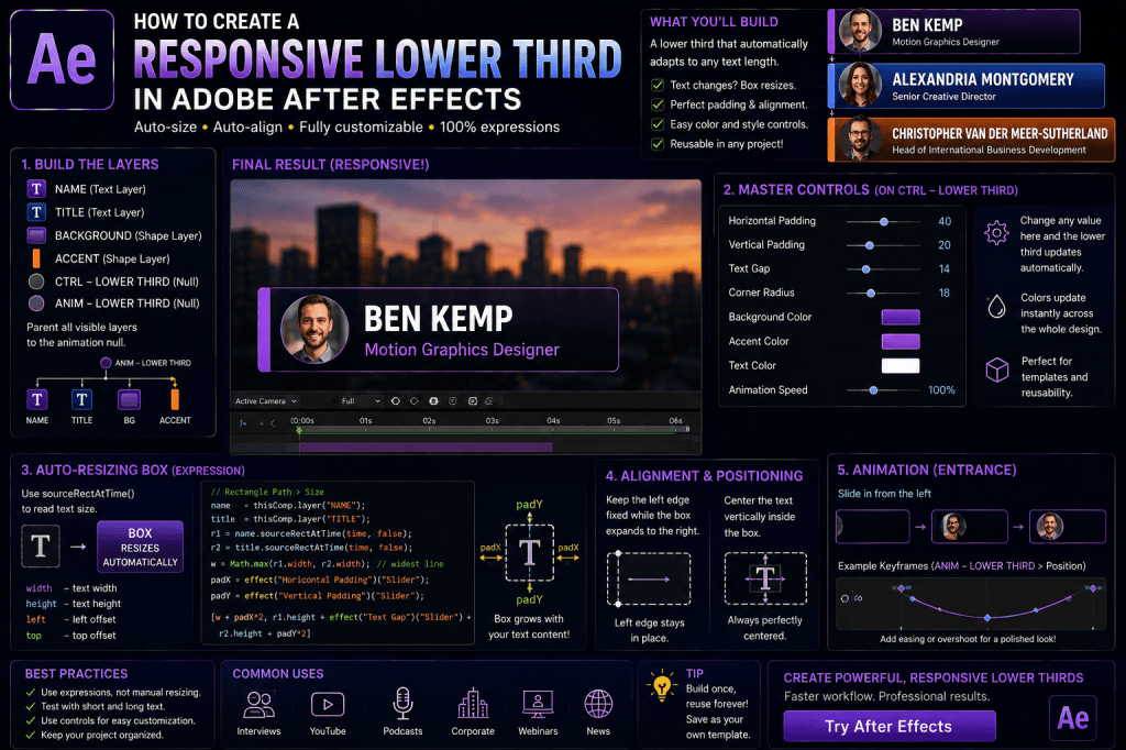
Using expressions, sourceRectAtTime(), Expression Controls, and a carefully structured Shape Layer, you can create a responsive lower third that automatically adapts whenever the text changes.
In this guide, we’ll build a reusable lower third in Adobe After Effects with automatic text-box resizing, adjustable padding, responsive positioning, color controls, animation controls, and a clean project structure suitable for repeated use.
Affiliate disclosure: This article contains affiliate links. If you purchase Adobe After Effects through one of these links, we may earn a commission at no additional cost to you.
What Is a Responsive Lower Third?
A responsive lower third automatically adjusts its design when its content changes.
For example, you might start with:
BEN KEMP
Motion Designer
Then replace it with:
ALEXANDRIA MONTGOMERY
Senior Creative Director
A traditional lower third may require you to resize the background manually.
A responsive lower third recalculates the layout automatically.
The background grows.
The text remains aligned.
Accent graphics move with the design.
Padding stays consistent.
That’s the goal.
What We’re Going to Build
Our lower third will contain:
Name
Job Title
Background
Accent Element
Master Controls
We’ll then add:
- automatic background sizing;
- horizontal padding;
- vertical padding;
- responsive alignment;
- background color;
- accent color;
- corner-radius control;
- entrance animation;
- exit animation.
The final result will be reusable with many different names and titles.
Why Build It Responsively?
Imagine producing 50 interview videos.
Each person has a different:
- name;
- title;
- company;
- text length.
If every lower third requires manual resizing, you’re creating unnecessary repetitive work.
A responsive template allows you to change the text and continue editing.
That’s a major production advantage.
Step 1: Create a New Composition
Create a new composition.
For example:
1920 × 1080
Choose the frame rate appropriate for your project.
Common choices include:
- 24 fps;
- 25 fps;
- 30 fps.
We’ll build the lower third near the bottom-left area of the composition.
Step 2: Create the Name Layer
Select the Type Tool.
Create a Text Layer.
Enter:
BEN KEMP
Choose a clear font and make the name visually prominent.
Rename the layer:
NAME
Good layer naming becomes increasingly important as expressions are added.
Step 3: Create the Job Title
Create another Text Layer beneath the name.
Enter:
Motion Graphics Designer
Make this text smaller than the name.
Rename the layer:
TITLE
Your basic typography hierarchy is now established.
Step 4: Create the Background
Create a Shape Layer.
Add:
Rectangle
and:
Fill
Place the rectangle behind both text layers.
Rename the Shape Layer:
BACKGROUND
At this point, manually size the rectangle roughly around the text.
We’ll automate it shortly.
Step 5: Add an Accent Element
Many lower thirds include a small visual accent.
This could be:
- a vertical line;
- a colored block;
- a small circle;
- an icon;
- a logo.
Create a simple vertical rectangle to the left of the text.
Rename it:
ACCENT
This will help demonstrate how responsive layouts can control more than just the background.
Step 6: Create a Master Controller
Create:
Layer → New → Null Object
Rename it:
CTRL — LOWER THIRD
This Null will contain the user-facing controls for the entire graphic.
If you’re learning After Effects and want to build projects like this yourself, you can explore Adobe’s current After Effects options here:
Explore Adobe After Effects and current plans
Add Horizontal Padding
Select:
CTRL — LOWER THIRD
Choose:
Effect → Expression Controls → Slider Control
Rename it:
Horizontal Padding
Set a reasonable starting value, such as:
40
This determines how much empty space appears to the left and right of the text.
Add Vertical Padding
Add another Slider Control.
Rename it:
Vertical Padding
Try:
20
This controls the space above and below the text.
Add Corner Radius
Add another Slider.
Rename it:
Corner Radius
This will control the background rectangle’s roundness.
Add Background Color
Add:
Effect → Expression Controls → Color Control
Rename it:
Background Color
Choose your preferred starting color.
Add Accent Color
Add another Color Control.
Rename it:
Accent Color
This will control the accent graphic.
Our Controller Now Contains
Horizontal Padding
Vertical Padding
Corner Radius
Background Color
Accent Color
Later, we can add additional controls for animation.
Step 7: Measure the Name
Now we need After Effects to understand the dimensions of the name.
We’ll use:
sourceRectAtTime()
Conceptually:
name = thisComp.layer("NAME");
nameRect = name.sourceRectAtTime(time,false);
This gives us access to:
- width;
- height;
- left;
- top.
Step 8: Measure the Job Title
Do the same for:
TITLE
Conceptually:
title = thisComp.layer("TITLE");
titleRect = title.sourceRectAtTime(time,false);
Now we know the dimensions of both lines.
Step 9: Determine the Required Width
Which line should determine the background width?
The wider one.
If:
NAME width = 300
and:
TITLE width = 420
the background needs to accommodate:
420 pixels.
If the name is wider, the background should use the name instead.
Use Math.max()
JavaScript provides:
Math.max()
This returns the largest value.
Conceptually:
contentWidth = Math.max(nameRect.width, titleRect.width);
Now the lower third automatically uses whichever text line is wider.
Add Horizontal Padding
Once we know the content width:
Background Width = Content Width + Padding
Remember that padding exists on both sides.
Conceptually:
backgroundWidth = contentWidth + padX * 2;
Now the rectangle has breathing room.
Calculate the Height
The vertical layout contains:
Name
Gap
Job Title
Top and bottom padding
You can calculate this dynamically.
For example:
contentHeight = nameHeight + gap + titleHeight
Then:
backgroundHeight = contentHeight + padY * 2
Now the lower third can also respond to changes in text height.
Add a Line Gap Control
For even more flexibility, add another Slider:
Text Gap
This controls the vertical space between:
NAME
and:
TITLE
Now users can adjust the typography spacing from the controller.
Background Size Expression
Conceptually, the Rectangle Path Size expression will:
- measure NAME;
- measure TITLE;
- find the larger width;
- calculate total height;
- add padding;
- return Width and Height.
This is the core responsive calculation.
Why This Is Better Than Manual Resizing
Change:
BEN KEMP
to:
CHRISTOPHER ALEXANDER ROBERTSON
The background expands.
Change the title to:
CEO
The background adjusts.
No manual Shape Layer editing.
Step 10: Keep the Left Edge Fixed
For a lower third, you often don’t want the rectangle to expand equally in both directions.
You want:
left edge fixed
and:
right edge expands
This preserves the graphic’s position in the frame.
Why Left Alignment Matters
Imagine the lower third starts:
100 pixels from the left edge.
If the background expands equally from its center, the left side moves closer to the frame edge as the text becomes longer.
That’s usually undesirable.
A left-anchored system keeps the design stable.
Rectangle Position Compensation
As Rectangle Path Size increases, adjust the rectangle’s Position so the left edge remains fixed.
Conceptually:
Position X = Width / 2
This means the rectangle’s center moves right as its width increases.
The left edge stays in place.
Step 11: Position the Name
Now establish a fixed text starting point relative to the background.
For example:
Left Edge + Horizontal Padding
The name always begins at the same padded position.
Step 12: Position the Job Title
The title should align with the name.
Its vertical position depends on:
- name height;
- text gap;
- padding.
You can either:
- position it manually if typography remains consistent;
- calculate it dynamically for a fully responsive system.
Fully Responsive Vertical Position
Conceptually:
Title Y
=
Name Y
Name Height
Text Gap
Now if the name’s font size or line height changes, the title can remain correctly positioned.
Step 13: Connect Background Color
Select the BACKGROUND Shape Layer.
Open:
Fill → Color
Enable an expression.
Use the Expression Pick Whip to reference:
CTRL — LOWER THIRD → Background Color
Now you can recolor the lower third from the controller.
Step 14: Connect Accent Color
Repeat the process for:
ACCENT
Connect its Fill Color to:
Accent Color
Now the entire color scheme can be adjusted from one layer.
Step 15: Connect Corner Radius
Open:
BACKGROUND → Rectangle Path → Roundness
Connect it to:
Corner Radius
Now the lower third can instantly change from:
square
to:
rounded
without opening the Shape Layer.
Create Different Visual Styles
With these controls, the same lower third can become:
Corporate
Small corner radius.
Restrained colors.
Modern UI
Large rounded corners.
Bright accent.
Broadcast
Sharp edges.
Strong accent bar.
Minimal
No accent and subtle background.
One responsive structure can support multiple styles.
Add an Accent Width Control
Create:
Accent Width
Slider.
Connect it to the accent Shape Layer.
Now the user can make the accent:
- thin;
- medium;
- bold.
Add an Accent Gap Control
You may also expose:
Accent Gap
This controls the distance between the accent and the background/text.
Again, the goal isn’t to expose every possible number.
Expose values that are genuinely useful.
Don’t Overload the Controller
A good template should be flexible.
But it should also be simple.
Ten meaningful controls are better than fifty confusing ones.
Ask:
Will the user realistically need to change this?
If not, keep it inside the rig.
Step 16: Animate the Lower Third
Once the responsive layout works, we can animate it.
The important rule is:
Don’t break the responsive properties.
If Rectangle Size is controlled by an expression, don’t animate that property unless your expression is specifically designed to accommodate animation.
Instead, animate the entire system.
Parent Everything to a Null
Create another Null:
ANIM — LOWER THIRD
Parent:
- NAME;
- TITLE;
- BACKGROUND;
- ACCENT;
to it.
Now you can animate the entire lower third using the animation Null.
Why Separate Control and Animation Nulls?
We now have:
CTRL — LOWER THIRD
for user settings.
And:
ANIM — LOWER THIRD
for motion.
This creates a clean separation between:
configuration
and:
animation.
That’s a strong project-organization pattern.
Create a Slide-In Animation
Move:
ANIM — LOWER THIRD
to the left, outside the frame.
Create a Position keyframe.
Move forward approximately:
10–20 frames.
Move the lower third into its final position.
Apply:
Easy Ease
Then refine the motion in the Graph Editor.
Add Overshoot
For a more energetic style, allow the lower third to move slightly past its final position before settling.
For example:
Off-screen
→
10 pixels past target
→
Final position
Keep the overshoot subtle for professional content.
Animate the Background First
Another popular approach is to animate the background before the text appears.
For example:
Accent appears
↓
Background expands
↓
Name appears
↓
Title appears
This creates a more layered reveal.
Use Masks for Text Reveals
Instead of simply fading the text, reveal it using masks or mattes.
For example:
The background slides in.
The name rises upward from behind the background edge.
The job title follows a few frames later.
This creates a polished broadcast-style result.
Stagger the Animation
Don’t make every element start at exactly the same frame.
Try:
Frame 0 — Accent
Frame 3 — Background
Frame 6 — Name
Frame 9 — Title
Small timing offsets create visual hierarchy.
Animate Opacity
For a simpler version:
Background: Position + Opacity
Name: Position + Opacity
Title: Position + Opacity
This is easy to build and works well for corporate projects.
Animate Scale
A more UI-like lower third could use:
Scale 95% → 100%
combined with:
Opacity 0 → 100%.
Keep the motion subtle.
Use Motion Blur
Enable Motion Blur for fast Position animations.
This can make the entrance and exit feel smoother and more natural.
Step 17: Create the Exit Animation
Don’t forget the outro.
A lower third shouldn’t remain on screen forever.
You can reverse the entrance:
Text disappears
↓
Background retracts
↓
Accent exits
Or simply move the entire system off-screen.
Use Animation Markers
For reusable projects, markers can help identify:
- intro;
- hold;
- outro.
This makes the timeline easier to navigate.
Create Intro and Outro Sections
A clean lower-third composition might have:
Frames 0–15
Intro.
Frames 16–120
Hold.
Frames 121–135
Outro.
Adjust according to your project’s frame rate and pacing.
Keep the Hold Section Flexible
In reusable templates, you may need the lower third to remain visible for different durations.
Avoid animation structures that make timing unnecessarily difficult to change.
Responsive Lower Third with a Logo
You can add a logo or profile image.
Now the layout might contain:
Logo
Name
Title
Background
The text’s horizontal starting point should account for:
Logo width + gap.
Add a Logo Gap Control
Create:
Logo Gap
as a Slider.
Now the spacing between the logo and text can be adjusted.
Optional Logo Checkbox
Add:
Show Logo
using Checkbox Control.
When enabled:
logo appears.
When disabled:
logo disappears and the text can move left.
This requires additional expression logic but makes the template much more flexible.
Responsive Lower Third with Social Icon
The same concept can be used for:
- Instagram handle;
- X username;
- LinkedIn profile;
- website URL.
The icon can remain a fixed distance from the text while the background adjusts automatically.
Add Company Name
You could extend the lower third to three lines:
Name
Job Title
Company
Now calculate:
- maximum width across all three;
- combined vertical height;
- gaps.
The same responsive principle still works.
Multiple Text Lines with Math.max()
Conceptually:
contentWidth = Math.max(nameWidth, titleWidth, companyWidth);
The widest text determines the background width.
Build a Speaker Identification Template
For interviews, create:
NAME
ROLE
COMPANY
PHOTO
The editor only changes these fields.
Everything else responds automatically.
This is a highly practical use of expressions.
Create a Centered Lower Third
Not every lower third needs to be left aligned.
For centered designs:
center stays fixed
while:
left and right edges expand equally.
This is useful for:
- speaker introductions;
- title cards;
- social video.
Create a Right-Aligned Lower Third
For a right-side layout:
right edge stays fixed
while:
left edge expands.
This can mirror your left-aligned design.
Build Left/Right Layout Options
A Dropdown Menu Control could provide:
Alignment
- Left
- Right
The expressions could then adjust:
- text alignment;
- background expansion;
- accent placement.
This is an advanced but useful template feature.
Create a Dark/Light Theme
Add a Dropdown:
Theme
- Dark
- Light
Use expressions to switch between predefined:
- background colors;
- text colors;
- accent colors.
Now the same lower third works on different footage.
Manual Colors vs Preset Themes
You can support both.
For example:
Theme Dropdown
selects common presets.
Color Controls
allow full customization.
This gives users both speed and flexibility.
Add an Animation Style Dropdown
You could also offer:
Animation Style
- Slide
- Fade
- Pop
This requires more advanced expression or template logic, but demonstrates how far a reusable system can go.
Responsive Lower Thirds for Vertical Video
The same technique works for:
1080 × 1920
vertical compositions.
However, you’ll need to reconsider:
- maximum width;
- font size;
- safe margins;
- text wrapping.
Responsive design becomes even more valuable because vertical layouts have less horizontal space.
Lower Thirds for Square Video
For:
1080 × 1080
social graphics, consider using:
- shorter text;
- narrower backgrounds;
- multi-line titles.
Again, responsive expressions reduce manual adjustment.
Safe Margins
Keep lower thirds away from the extreme edges of the composition.
Consider:
- platform UI overlays;
- subtitles;
- cropping;
- broadcast-safe regions.
Position the entire system using the animation Null rather than changing internal responsive values.
Test with Real Names
Don’t only test:
BEN KEMP
Try:
A
Li Wei
Christopher Montgomery
Alexandria Van der Meer-Sutherland
Your layout should remain visually balanced.
Test with Long Titles
Try:
CEO
and:
Senior Vice President of International Business Development
If the second title becomes too wide, decide whether your template should:
- grow;
- wrap;
- reduce font size;
- enforce a maximum width.
Maximum Width Strategy
A background that grows indefinitely can eventually leave the frame.
For production templates, define a maximum usable width.
When text exceeds that width, wrapping is often preferable.
Point Text vs Paragraph Text
Point Text naturally grows horizontally.
Paragraph Text can wrap inside a defined text box.
For lower thirds with unpredictable long titles, Paragraph Text may provide better control.
Consider Two-Line Titles
Instead of allowing a job title to stretch across the entire screen, design the template to support:
Senior Vice President
International Business Development
This often produces a better composition.
Test Font Changes
If users can change fonts, test the responsive system with several typefaces.
Fonts have different:
- character widths;
- ascenders;
- descenders;
- line heights.
Your padding controls should accommodate these differences.
Test Uppercase and Lowercase
Compare:
BEN KEMP
with:
Ben Kemp
The measured dimensions will differ.
Make sure both remain visually balanced.
Test Numbers and Symbols
Try:
Episode #125
CEO & Founder
R&D Director
Real-world text often contains punctuation and symbols.
Create a Minimum Width
A very short name such as:
Li
might create a box that’s visually too small.
Use:
Math.max()
to enforce a minimum width.
Conceptually:
Width = max(Calculated Width, Minimum Width)
Add Minimum Width Control
Create:
Minimum Width
Slider.
Now the user can determine the smallest allowed background.
Create a Maximum Width
You can similarly constrain the design’s maximum dimensions, although text wrapping and layout logic become more important at that stage.
Keep the Expression Code Readable
As the rig becomes more complex, use variables.
Instead of repeating:
thisComp.layer("NAME").sourceRectAtTime(time,false).width
multiple times, create:
name = thisComp.layer("NAME");
nr = name.sourceRectAtTime(time,false);
Then use:
nr.width
This makes the expression much easier to understand.
Comment Your Expressions
For complex rigs, add comments.
For example:
// Measure name and title
// Calculate widest text
// Add padding
This is especially valuable if you return to the project months later.
Common Mistake: Building Animation Before Responsiveness
Build the layout first.
Make sure the lower third responds correctly.
Then animate it.
Otherwise, you’ll be troubleshooting layout and motion simultaneously.
Common Mistake: Everything on One Layer
Separate:
- content;
- design;
- controls;
- animation.
This makes the system easier to maintain.
Common Mistake: No Master Controller
A reusable lower third should not require users to search through ten layers for settings.
Centralize important options.
Common Mistake: Too Many Controls
Don’t expose values that nobody needs.
Keep the interface practical.
Common Mistake: No Minimum Width
Short names can produce awkward layouts.
Common Mistake: Unlimited Width
Long job titles can push the graphic outside the composition.
Plan for edge cases.
Common Mistake: No Outro
Lower thirds need to disappear cleanly too.
Common Mistake: Too Much Motion
Lower thirds support information.
They shouldn’t distract from the speaker.
Keep animation appropriate to the content.
Common Mistake: Poor Contrast
Make sure the text remains readable over the background and footage.
Common Mistake: Tiny Job Titles
Don’t sacrifice readability to fit long text.
Wrapping is often better than making the font extremely small.
Common Mistake: Ignoring Mobile Viewing
Many viewers watch video on small screens.
Your lower third should remain readable at reduced display sizes.
Responsive Lower Third Project Structure
A clean composition might contain:
CTRL — LOWER THIRD
ANIM — LOWER THIRD
NAME
TITLE
ACCENT
BACKGROUND
This is simple enough to understand but flexible enough for professional use.
Recommended Control Panel
Your controller could contain:
Horizontal Padding
Vertical Padding
Text Gap
Minimum Width
Corner Radius
Background Color
Accent Color
That’s already enough for a highly customizable lower third.
Optional Advanced Controls
You might later add:
Show Logo
Logo Gap
Theme
Alignment
Animation Speed
Animation Style
But add these only if your workflow requires them.
Turn the Lower Third into a Reusable Preset
Once your system works, save a master project or template.
Don’t rebuild the lower third from scratch every time.
Create versions such as:
Corporate Lower Third
YouTube Lower Third
Podcast Lower Third
Minimal Lower Third
Social Lower Third
Why Templates Save Time
The first responsive lower third takes longer to build than a basic one.
But every reuse saves time.
After ten, fifty, or one hundred videos, the efficiency difference becomes substantial.
Five Lower Third Exercises
Exercise 1 — Basic Responsive Name Box
Create one name and an auto-resizing rectangle.
Exercise 2 — Add Job Title
Make the background accommodate both lines.
Exercise 3 — Add Master Controls
Expose padding, colors, and corner radius.
Exercise 4 — Animate the System
Create a slide-in and slide-out.
Exercise 5 — Stress Test It
Try very short and very long names and titles.
If the design survives all five exercises, you have a solid responsive lower-third foundation.
Frequently Asked Questions
What is a responsive lower third?
It’s a lower-third graphic that automatically adapts when text or other content changes.
Can After Effects automatically resize lower-third backgrounds?
Yes. Expressions using sourceRectAtTime() can measure text and drive Shape Layer dimensions.
Can a lower third support different name lengths?
Yes.
Can it support different job-title lengths?
Yes.
Can I use two or more lines?
Yes.
Can I add automatic padding?
Yes.
Can padding be adjustable?
Yes. Slider Controls are ideal.
Can I change the background color from one control?
Yes. Use Color Control.
Can I create rounded corners?
Yes. Link Rectangle Path Roundness to a Slider Control.
Can the left edge remain fixed?
Yes. Position compensation can allow the background to grow only toward the right.
Can I create right-aligned versions?
Yes.
Can I animate a responsive lower third?
Yes. It’s usually best to keep responsive layout calculations separate from entrance and exit animation.
Can I create a reusable Motion Graphics Template?
Yes. Responsive lower thirds are excellent candidates for reusable template workflows.
Do I need a plug-in?
No. The core techniques use native After Effects features.
Practice Building a Responsive Lower Third
Start simple.
Create:
NAME
TITLE
BACKGROUND
Make the background resize automatically.
Then add:
Horizontal Padding
and:
Vertical Padding.
Once the layout works, create:
CTRL — LOWER THIRD
and move the user-facing controls there.
Add colors and corner radius.
Finally, parent the visual elements to:
ANIM — LOWER THIRD
and create your entrance and exit.
This sequence keeps the project manageable.
If you’d like to build responsive lower thirds and other motion graphics yourself, you can explore Adobe’s current After Effects options here:
Get Adobe After Effects and start creating reusable motion graphics
What Should You Learn Next?
We’ve now used expressions to create:
- procedural movement;
- loops;
- bounce;
- master controls;
- property relationships;
- audio reaction;
- responsive text boxes;
- responsive lower thirds.
The next step is to explore another extremely useful motion-design workflow:
automatically counting numbers.
This is useful for:
- statistics;
- percentages;
- prices;
- subscriber counts;
- dashboards;
- financial graphics;
- infographics.
The next article will therefore be:
How to Create an Animated Number Counter in Adobe After Effects with Expressions.
We’ll create counters that animate from one value to another and then extend them with:
- decimals;
- percentages;
- currency symbols;
- commas;
- prefixes;
- suffixes.
Final Thoughts
A responsive lower third is an excellent example of how expressions can improve a real production workflow.
The goal isn’t simply to create something technically impressive.
The goal is to eliminate repetitive work.
Instead of:
Change text → resize background → reposition graphics → check alignment
you create:
Change text → everything updates automatically.
The core techniques are straightforward:
Use sourceRectAtTime() to measure text.
Use Math.max() to identify the widest line.
Add adjustable padding.
Keep one edge anchored when appropriate.
Use Expression Controls for user-facing settings.
Separate layout logic from animation.
Stress-test the design with realistic content.
Once you’ve built one reliable responsive lower third, you can reuse the same principles across:
- captions;
- buttons;
- callouts;
- labels;
- social graphics;
- title cards;
- Motion Graphics Templates.
That’s when After Effects expressions become more than animation shortcuts.
They become a way to build smarter motion-design systems.
Explore Adobe After Effects and start building responsive motion graphics