A handwriting animation makes text appear as though it is being written onto the screen in real time.
It is a classic Adobe After Effects technique that works particularly well for:
- signatures;
- handwritten titles;
- logo reveals;
- wedding videos;
- documentary titles;
- social-media graphics;
- educational videos;
- personal branding;
- animated illustrations;
- calligraphy.
The effect can range from a simple signature drawing itself onto the screen to a convincing animation in which a pen actually follows the handwriting.
There are several ways to create the effect in After Effects, and the best method depends on the artwork you’re starting with.
In this guide, we’ll look at the main approaches, including Trim Paths, Shape Layers, masks, the Stroke effect, and animated pen-follow techniques.
By the end, you’ll understand how to choose the right workflow and create a smooth handwriting or signature reveal.
Affiliate disclosure: This article contains affiliate links. If you purchase Adobe After Effects through one of these links, we may earn a commission at no additional cost to you.
What Is a Handwriting Animation?
A handwriting animation reveals letters progressively so they appear to have been written by hand.
Instead of an entire word appearing simultaneously:
Creative
the individual strokes appear in sequence.
The animation might look like:
C → Cr → Cre → Crea → Creat → Creative
But a convincing handwriting effect doesn’t simply reveal individual letters.
It follows the actual path a pen would take when writing them.
That distinction is important.
What Is a Signature Animation?
A signature animation uses the same principle but usually works with a person’s signature or stylized handwritten logo.
The signature starts invisible.
Then its strokes progressively appear until the complete signature is visible.
Signature animations are commonly used for:
- personal brands;
- portfolio introductions;
- video outros;
- email-signature graphics;
- wedding videos;
- documentary titles;
- logo animation.
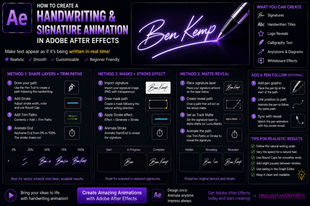
Three Main Methods
There are several ways to create handwriting animation in After Effects.
The three most useful are:
Method 1 — Shape Layers + Trim Paths
Best for vector artwork and stroked paths.
Method 2 — Masks + Stroke Effect
Useful when revealing existing artwork or handwriting.
Method 3 — Track Matte / Reveal Technique
Useful when the original lettering needs to remain visually unchanged.
We’ll explore each approach.
Method 1: Shape Layers and Trim Paths
If your handwriting is already represented as vector strokes, Trim Paths is often the cleanest solution.
This builds directly on the Trim Paths technique covered in our previous tutorial.
Step 1: Prepare the Handwriting
You can create the handwriting in:
- Adobe Illustrator;
- After Effects;
- another vector application.
The important point is that the writing should ideally be represented by paths that follow the direction a pen would travel.
Why Path Structure Matters
Imagine the letter:
S
A handwriting animation should follow the stroke from its beginning to its end.
If your vector artwork is merely the outer outline of a filled letter, Trim Paths may trace around the perimeter instead of drawing through the center.
That doesn’t look like handwriting.
Centerline Paths vs Outlines
For handwriting animation, a centerline path is often preferable.
Think of the path as:
the route traveled by the pen.
The Stroke around that path creates the visible handwriting.
Step 2: Create a Shape Layer
In After Effects, create or import your path.
If you’re drawing directly in After Effects:
- Deselect all layers.
- Select the Pen Tool.
- Draw along the handwriting path.
After Effects creates a Shape Layer.
Step 3: Add a Stroke
Open:
Contents
and make sure your path has a Stroke.
Set:
Stroke Width
to approximately match the desired handwriting thickness.
Choose:
Round Cap
for smoother line endings.
Step 4: Add Trim Paths
Choose:
Contents → Add → Trim Paths
Expand:
Trim Paths 1
You’ll see:
Start
End
Offset
For a standard handwriting reveal, we’ll mainly use:
End.
Step 5: Animate End
At the beginning:
End = 0%
Create a keyframe.
Move forward.
Set:
End = 100%.
Preview the animation.
The Stroke draws itself along the path.
You have created the basic handwriting effect.
If you’d like to practice handwriting, Trim Paths, and Shape Layer animation yourself, you can explore Adobe’s current After Effects options here:
Explore Adobe After Effects and current plans
Step 6: Adjust the Timing
A signature shouldn’t necessarily draw at one perfectly constant speed.
Real handwriting changes speed.
Writers may:
- move quickly through long strokes;
- slow around curves;
- pause between letters;
- accelerate through flourishes.
Use keyframes and the Graph Editor to make the animation feel more organic.
Linear vs Eased Motion
Linear animation gives a constant drawing speed.
This may work well for:
- technical line drawings;
- geometric logos.
For handwriting, subtle speed variation often looks more natural.
Don’t overdo the easing, though.
Multiple Strokes
Many letters cannot realistically be written as one continuous path.
For example, writing:
t
may involve:
- vertical stroke;
- cross stroke.
Similarly, letters such as:
i
require a dot.
Treat these as separate Shape Paths.
Animate Strokes in Writing Order
A realistic animation should follow the order a person would actually write the text.
For example:
Main word.
Then:
cross the t.
Then:
dot the i.
Then:
add underline or flourish.
This small detail can make the effect much more convincing.
Separate Shape Groups
Create groups such as:
Main Signature
T Cross
I Dot
Underline
Each can have its own animation.
Animate the Dot
Dots don’t necessarily need Trim Paths.
A simple Scale animation can work well.
For example:
0% → 110% → 100%
This creates a subtle pop.
Animate an Underline
If the signature includes an underline or flourish:
Create it as a separate path.
Add Trim Paths.
Animate it after the main signature completes.
Signature Animation Sequence
A polished sequence might be:
0:00–0:01.2
Main signature draws.
0:01.2–0:01.4
T crosses.
0:01.4–0:01.6
I dot appears.
0:01.6–0:02.1
Underline flourish draws.
Now the animation feels intentional.
Method 2: Masks and the Stroke Effect
Sometimes you already have a signature as:
- PNG;
- scanned image;
- photograph;
- raster graphic.
You may want to preserve the original appearance rather than recreating it as a simple Shape Layer Stroke.
In that case, a mask-based reveal can be useful.
Step 1: Import the Signature
Import your signature image into After Effects.
Ideally, use:
- high resolution;
- transparent background;
- strong contrast.
A PNG with transparency is convenient.
Step 2: Create a Solid
Create:
Layer → New → Solid
Place it appropriately in the composition.
Step 3: Draw Masks Along the Signature
Using the Pen Tool, create mask paths that follow the center of the handwriting.
Trace the order in which the signature would be written.
Don’t simply outline the letters.
Follow the actual writing motion.
Step 4: Apply the Stroke Effect
Apply:
Effect → Generate → Stroke
Configure the effect to follow the mask path.
Adjust:
- Brush Size;
- Brush Hardness;
- Paint Style.
Step 5: Animate the Stroke
Animate the Stroke effect’s reveal parameter so the stroke progresses along the mask.
The animated Stroke can then serve as a reveal mechanism for the underlying signature.
Why This Method Is Useful
The original signature artwork remains intact.
You’re using the animated stroke primarily to control:
where
and:
when
the signature becomes visible.
This can preserve:
- texture;
- pressure variation;
- ink imperfections;
- brush detail.
Method 3: Matte-Based Signature Reveal
A matte-based workflow is particularly useful when the handwriting contains texture.
For example:
- ink;
- chalk;
- paint;
- brush strokes;
- marker;
- pencil.
Instead of replacing that texture with a uniform Shape Layer Stroke, create an animated reveal that exposes the original artwork.
Basic Structure
You have:
Original Signature
and:
Animated Reveal Layer
The reveal layer follows the writing path.
The original signature is visible only where the reveal passes.
Why Use a Matte?
Suppose your original signature has:
- thick and thin strokes;
- rough edges;
- ink texture.
A simple vector Stroke would lose those characteristics.
A matte lets you keep the original visual appearance.
Make the Reveal Stroke Wide Enough
The reveal Stroke must cover the full width of the original handwriting.
If it’s too narrow, parts of the letters won’t appear.
Increase the Brush or Stroke Width until the reveal fully covers the artwork.
But Avoid Revealing Nearby Letters
This creates a common problem.
If letters are close together, a wide reveal Stroke might expose a neighboring stroke too early.
For example, while revealing:
e
you might accidentally reveal part of:
l
next to it.
Solve It with Multiple Masks
Break the writing into smaller sections.
Instead of one huge reveal path:
- create several masks;
- control their timing separately.
This gives you much more precise control.
Work at High Zoom
When tracing handwriting, zoom in.
Pay attention to:
- overlapping strokes;
- crossings;
- dots;
- loops;
- flourishes.
The more accurately your reveal path follows the actual writing order, the more convincing the result.
How Long Should a Signature Animation Be?
There is no fixed duration.
But many signature animations work well between:
1 and 4 seconds.
A short simple signature:
approximately 1–2 seconds.
A detailed calligraphic signature:
2–4 seconds.
A very elaborate handwritten title:
possibly longer.
Don’t Animate Every Millimeter at the Same Speed
Real handwriting has rhythm.
Long strokes can move quickly.
Detailed loops may slow slightly.
Flourishes may accelerate.
Use timing to create personality.
Add a Pen Following the Signature
A moving pen can make the animation much more convincing.
The pen tip follows the same path that reveals the writing.
Basic Pen-Follow Workflow
You need:
Writing Path
Pen Graphic
Reveal Animation
The pen’s Position follows the writing path while the Stroke or Trim Paths animation reveals the text.
Create the Pen Graphic
You can use:
- pen;
- pencil;
- marker;
- brush;
- stylus.
Use an image with transparency or create a simple vector illustration.
Place the Anchor Point at the Tip
This is critical.
Move the pen layer’s Anchor Point to:
the pen tip.
Now when the Position follows the path, the tip remains aligned with the writing.
Copy a Path to Position
One common After Effects technique is:
- Select a path.
- Copy it.
- Select the Pen Layer’s Position.
- Paste.
After Effects can create Position keyframes corresponding to the path.
The pen then follows the path.
Synchronize the Pen and Reveal
The pen motion and handwriting reveal must use matching timing.
If the pen moves ahead of the visible Stroke, the illusion breaks.
If the Stroke appears before the pen arrives, it also looks wrong.
Match Keyframe Timing
Keep:
Pen Position
and:
Stroke Reveal
synchronized.
This may require manual refinement.
Orient the Pen Along the Path
A pen that remains at one fixed angle can look unnatural on curved handwriting.
You can animate Rotation manually or use orientation techniques to make it follow the direction of travel.
Don’t Rotate Too Aggressively
A real hand doesn’t spin a pen dramatically around every curve.
Keep rotation subtle.
Add a Hand?
You can go further and animate:
- hand;
- pen;
- shadow.
But complexity increases significantly.
For most title and signature animations, a moving pen alone is enough.
Add a Cursor Instead
For digital-writing effects, replace the pen with:
- stylus;
- glowing point;
- cursor;
- animated dot.
This works well for:
- technology graphics;
- UI animation;
- educational videos.
Create a Glowing Handwriting Effect
Start with your handwriting Stroke.
Add:
Glow
Adjust:
- Glow Radius;
- Glow Intensity.
Now the signature can look like:
- neon;
- light painting;
- laser writing.
Duplicate for Stronger Glow
A common technique is:
- Duplicate the handwriting layer.
- Apply stronger Glow to the lower copy.
- Keep the upper copy sharper.
This creates a bright core with softer outer light.
Animate Glow Intensity
As the line is being drawn, slightly increase the Glow around the active tip.
After the writing completes, reduce it.
This can make the drawing process feel energetic.
Create a Light Trail
Use a short visible segment rather than permanently revealing the entire path.
Animate:
Start
and:
End
together.
Now the visible Stroke travels along the handwriting path.
This creates a light-trail effect rather than permanent writing.
Signature with Permanent Reveal
For a normal signature:
End increases
while:
Start remains at 0.
The completed Stroke remains visible.
Traveling Light Signature
For a traveling highlight:
animate:
Start
behind:
End.
The visible segment moves along the signature.
Combine Both
You can have:
Permanent signature
plus:
moving glow highlight.
Duplicate the path.
Layer 1:
permanent reveal.
Layer 2:
short glowing traveling segment.
This creates a polished finish.
Create Chalk Writing
For a chalkboard effect, use:
- textured handwriting artwork;
- matte reveal;
- subtle roughness;
- dust particles.
A perfectly clean vector Stroke may look too digital.
Create Marker Writing
Use:
- thick Stroke;
- Round Cap;
- slight texture;
- fast writing speed.
Marker handwriting often benefits from bold, smooth paths.
Create Ink Writing
Use the original textured signature as the final artwork.
Reveal it using a matte.
This preserves natural variation.
Create Pencil Writing
Use:
- textured Stroke;
- reduced opacity;
- rough edges;
- subtle grain.
You can also add a faint pencil sound in the final video edit.
Sound Design
Sound can significantly improve handwriting animation.
Consider:
- pen scratching;
- marker squeak;
- pencil writing;
- fountain-pen sound;
- subtle whoosh for logo reveals.
Keep the sound synchronized with the drawing speed.
Handwriting Text vs Typed Fonts
A handwriting font doesn’t automatically create realistic handwriting animation.
Why?
Because the font is typically composed of filled letter outlines rather than the actual path a pen would follow.
Can You Animate a Handwriting Font?
Yes, but you often need to create a reveal path manually.
The font provides the visual artwork.
Your masks or strokes determine the animation.
Convert Text to Shapes?
You can convert suitable text to Shape Layers.
However, the resulting paths typically represent the outlines of the letters.
Animating those outlines with Trim Paths may produce an outline-drawing effect rather than authentic handwriting.
When Outline Animation Is Fine
Outline animation can still look excellent for:
- logos;
- geometric typography;
- neon lettering;
- title graphics.
Just don’t confuse it with realistic handwriting.
Signature from a Photograph
If you only have a photograph of a signature:
- Crop it.
- Improve contrast.
- Remove the background.
- Clean the edges.
- Import it into After Effects.
- Create a reveal path.
For the best result, prepare a transparent PNG first.
Signature from a Scan
A high-resolution scan is usually better than a photograph.
It provides:
- consistent lighting;
- less distortion;
- cleaner edges.
Use Illustrator for Complex Signatures
For detailed signatures, Adobe Illustrator can help prepare vector artwork.
You can then import it into After Effects.
This combination is particularly useful for:
- logo animation;
- calligraphy;
- branded signatures.
Handwriting Logo Reveal
Suppose your company logo contains handwritten lettering.
A strong animation sequence could be:
Signature draws
↓
Symbol appears
↓
Tagline fades in
↓
Logo holds
Keep the entire sequence relatively short.
Personal Brand Intro
A handwritten name can create a personal feel.
For example:
Ben Kemp
draws onto the screen.
Then:
Motion Design Tutorials
fades in beneath it.
This is well suited to:
- YouTube intros;
- portfolio videos;
- personal websites.
Wedding Title
Handwriting animation is especially effective for:
Sarah & James
followed by:
August 9, 2026
Use:
- elegant calligraphy;
- slower reveal;
- subtle particles;
- gentle music.
Documentary Title
A handwritten title can make documentary content feel:
- personal;
- historical;
- journalistic.
Combine it with:
- paper texture;
- archival imagery;
- restrained animation.
Educational Videos
Handwriting effects can simulate a teacher writing:
- equations;
- labels;
- arrows;
- diagrams.
This can help direct attention through the explanation.
Animate a Diagram Being Drawn
The same technique isn’t limited to text.
You can animate:
- arrows;
- circles;
- diagrams;
- sketches;
- annotations.
Any stroked path can potentially use Trim Paths.
Whiteboard Animation
Create:
- handwritten text;
- simple illustrations;
- arrows;
- diagrams.
Reveal them sequentially.
This produces a whiteboard-style explainer.
Synchronize with Voiceover
For educational animation, match the drawing to the narration.
If the narrator says:
“The signal moves from the client to the server…”
draw the corresponding arrow during that sentence.
Motion reinforces the explanation.
Create a Master Progress Slider
For more complex handwriting, you can control several strokes using one:
Progress
Slider.
Set it:
0–100.
Map different paths to different portions of that range.
Example
Main word:
Progress 0–70.
Cross stroke:
70–80.
Dot:
80–85.
Underline:
85–100.
Now one Slider controls the entire signature animation.
Why Use a Master Progress Control?
It makes timing much easier.
Instead of adjusting many separate keyframes, animate:
Progress 0 → 100.
All sub-elements follow.
Use linear() for Mapping
Expressions can map the master Progress range to each Trim Paths End property.
Conceptually:
Main path responds from:
0–70.
Underline responds from:
85–100.
This creates a reusable procedural signature animation.
Add an Animation Speed Control
If your setup is expression-driven, you can expose additional controls.
However, for many signature animations, simply adjusting the master Progress keyframes is easier.
Reusable Signature Template
Organize the composition:
CTRL — SIGNATURE
PEN
MAIN SIGNATURE
CROSS STROKES
DOTS
UNDERLINE
BACKGROUND
This keeps the project understandable.
Use Pre-Compositions
For a complex signature, pre-compose the handwriting.
Then the main composition can treat it as a single animated element.
This makes it easier to:
- reposition;
- scale;
- fade;
- reuse.
Keep Vector Quality
If using Shape Layers, scaling remains clean because the artwork is vector-based.
This is useful when creating versions for:
- HD;
- 4K;
- vertical video;
- social graphics.
Add Entrance and Exit Animation
The handwriting reveal is usually the entrance.
For the exit, you could:
- fade out;
- erase backward;
- dissolve;
- retract the Stroke.
Reverse the Writing
Animate:
Start 0 → 100
after the signature is complete.
The signature appears to erase itself from beginning to end.
Draw On, Erase Off
A useful sequence is:
End 0 → 100
Hold.
Then:
Start 0 → 100
The signature draws on and later disappears along the same path.
Loop the Animation
For decorative handwriting:
- Draw on.
- Hold.
- Erase.
- Repeat.
Use expressions or repeated keyframes.
Avoid Endless Loops for Logos
A constantly redrawing signature can become distracting.
For logos, one reveal followed by a hold is usually more effective.
Common Mistake: Tracing Letter Outlines
If you’re trying to create realistic handwriting, don’t trace around the outside of every letter.
Follow the pen’s centerline.
Common Mistake: Wrong Stroke Order
Dotting an i before writing the word may look unnatural.
Follow realistic writing order.
Common Mistake: Uniform Speed
Perfectly constant motion can feel mechanical.
Introduce subtle timing variation.
Common Mistake: Reveal Stroke Too Narrow
When using a matte, the reveal needs to cover the entire original artwork.
Common Mistake: Reveal Stroke Too Wide
A very wide Stroke may expose nearby parts prematurely.
Break complex words into multiple reveal paths.
Common Mistake: Pen Doesn’t Match Stroke
If the pen is ahead or behind the writing, viewers notice immediately.
Synchronize carefully.
Common Mistake: Pen Anchor Point Is Wrong
Place the Anchor Point at the pen tip.
Common Mistake: Excessive Pen Rotation
Keep the orientation believable.
Common Mistake: Too Many Effects
A signature animation is often strongest when it’s simple.
Good path movement matters more than adding dozens of effects.
Common Mistake: Animation Is Too Fast
Give viewers enough time to perceive the writing motion.
Common Mistake: Animation Is Too Slow
A five-letter signature doesn’t need 15 seconds.
Match timing to complexity.
Best Workflow for Different Sources
Vector Centerline Paths
Use:
Shape Layers + Trim Paths
Raster Signature
Use:
Masks + Stroke + Matte
Textured Ink or Brush Artwork
Use:
Matte Reveal
Geometric Logo Outline
Use:
Shape Layers + Trim Paths
Handwriting Font
Use:
Original text/artwork + manually created reveal path
Five Handwriting Animation Exercises
Exercise 1 — Single Line
Draw one curved Shape Layer path.
Animate it with Trim Paths.
Exercise 2 — Simple Word
Write a short word using several connected paths.
Reveal it naturally.
Exercise 3 — Signature
Trace a signature and animate the strokes in writing order.
Exercise 4 — Add a Pen
Animate a pen graphic along the writing path.
Exercise 5 — Textured Reveal
Use a raster signature and reveal it with an animated matte.
After these five exercises, you’ll understand the main handwriting workflows.
Practical Project: Animated Personal Signature
Start with a transparent PNG of your signature.
Create reveal paths following the natural writing direction.
Use those paths to expose the original signature.
Add a subtle pen sound.
Then add a small tagline beneath it.
This creates a professional personal-brand animation.
Practical Project: Neon Signature
Create vector handwriting.
Use Trim Paths.
Add Glow.
Duplicate the Stroke for additional light.
Animate a brighter highlight along the path.
Place everything on a dark background.
Practical Project: Wedding Title
Create elegant handwritten names.
Animate them slowly.
Add:
- date;
- subtle decorative line;
- gentle fade.
Keep the animation restrained.
Practical Project: Whiteboard Explanation
Draw:
- text;
- arrows;
- circles;
- simple diagrams.
Reveal each path according to the voiceover.
Use a hand or marker graphic if desired.
Frequently Asked Questions
How do I animate handwriting in After Effects?
Create paths that follow the writing direction and progressively reveal them using Trim Paths, the Stroke effect, or a matte.
Is Trim Paths good for handwriting?
Yes, particularly when your handwriting consists of Shape Layer centerline paths.
Can I animate a real signature?
Yes. Import the signature and create animated paths that reveal it.
Can I use a PNG signature?
Yes. A transparent PNG works particularly well with a matte-based reveal.
Can I use a handwriting font?
Yes, but you’ll usually need to create reveal paths manually for convincing handwriting.
Why does Trim Paths outline my letters?
Converted text often creates paths around the outside of letters rather than the centerline a pen would follow.
Can I animate a pen following the handwriting?
Yes.
Where should the pen’s Anchor Point be?
At the tip.
Can I animate an Illustrator signature?
Yes. Illustrator is useful for preparing vector artwork that can be brought into After Effects.
Can I create neon handwriting?
Yes. Combine Trim Paths with Glow and layered Strokes.
Can I make the signature erase itself?
Yes. Animate Start after End has reached 100%.
Can I loop handwriting?
Yes, although continuous looping isn’t always appropriate for logo or signature animations.
Do I need a plug-in?
No. The primary techniques can be created with native After Effects tools.
Practice Handwriting Animation
Start with a simple word.
Don’t begin with an elaborate calligraphic signature.
Draw something like:
Hello
using a few Shape Layer paths.
Add Trim Paths.
Animate each stroke in order.
Then add:
- dot;
- cross stroke;
- underline.
Once the timing feels natural, try a real signature.
After that, experiment with a textured matte reveal.
The key principle is simple:
Animate the path the pen would actually travel.
If you get that right, the effect becomes much more convincing.
If you’d like to practice handwriting and signature animation yourself, you can explore Adobe’s current After Effects options here:
Get Adobe After Effects and start creating handwriting animations
What Should You Learn Next?
Handwriting animation naturally introduces another important Shape Layer technique:
Repeater.
The Repeater lets you duplicate shapes procedurally and create:
- radial patterns;
- repeated lines;
- geometric designs;
- animated backgrounds;
- loading indicators;
- motion-graphics patterns;
- abstract animations.
Instead of manually duplicating 20 layers, you can create one Shape and let After Effects generate the rest.
The next article will therefore be:
How to Use the Repeater in Adobe After Effects: Create Repeating Shape Animations.
We’ll cover copies, offset, Transform Repeater controls, radial repetition, trails, spirals, grids, and practical motion-design examples.
Final Thoughts
Handwriting animation is a perfect example of an effect where the quality depends less on complicated effects and more on understanding how the original motion would happen.
The essential question is:
How would a pen actually write this?
Build your animation around that path.
For clean vector handwriting:
use Shape Layers and Trim Paths.
For existing signatures and textured artwork:
use an animated matte or Stroke-based reveal.
For additional realism:
add a pen following the path.
Then refine:
- stroke order;
- speed;
- pauses;
- crossings;
- dots;
- flourishes.
Once you understand these principles, the same workflow can be used for far more than signatures.
You can animate:
- handwritten titles;
- logos;
- diagrams;
- annotations;
- sketches;
- whiteboard graphics;
- decorative lines.
And because all of the core techniques are available directly inside After Effects, you can create sophisticated handwriting animations without relying on third-party plug-ins.
Explore Adobe After Effects and start creating handwriting and signature animations