Text animation is one of the most useful skills you can learn in Adobe After Effects.
From a simple title fading onto the screen to sophisticated kinetic typography where individual letters move, rotate, scale, and change color, After Effects provides an enormous amount of control over animated text.
You can use these techniques for:
- YouTube videos;
- advertisements;
- title sequences;
- social-media content;
- explainer videos;
- corporate presentations;
- documentaries;
- product videos;
- motion graphics;
- film and television.
And you don’t need complicated plug-ins to get started.
After Effects includes powerful native text-animation tools that allow you to animate entire text layers, individual words, individual characters, and even specific ranges of characters.
In this guide, we’ll start with simple text animation using keyframes and gradually move into Text Animators, Range Selectors, character-based animation, tracking, blur, 3D text, and techniques for creating smoother professional motion.
Affiliate disclosure: This article contains affiliate links. If you purchase Adobe After Effects through one of these links, we may earn a commission at no additional cost to you.
What Is Text Animation in After Effects?
Text animation simply means changing one or more properties of text over time.
A title could:
- move;
- fade;
- scale;
- rotate;
- blur;
- change color;
- reveal one letter at a time;
- expand its tracking;
- animate word by word;
- move through 3D space.
The simplest approach is to animate the entire text layer.
More advanced techniques use After Effects’ dedicated Text Animators to control individual characters, words, or lines.
Understanding both methods gives you much greater creative flexibility.
Before You Start
You should understand basic After Effects keyframes before working through the more advanced sections of this tutorial.
If you’re new to animation, start with:
How to Use Keyframes in Adobe After Effects: Complete Beginner Guide
And if your animation feels too mechanical, also read:
Adobe After Effects Graph Editor: How to Create Smooth, Professional Animation
Those two skills—keyframes and easing—form the foundation of good text animation.
If you haven’t installed After Effects yet, you can check Adobe’s current options here:
Get Adobe After Effects and explore the current plans
Step 1: Create a Composition
Open After Effects and create a new composition.
For practice, keep it short.
A five- or ten-second composition is more than enough.
Choose settings appropriate for your intended output.
For example, if you’re learning with standard horizontal video, you might work with a Full HD composition.
If you’re creating vertical social content, use a vertical format appropriate for your platform.
The animation principles remain the same.
Step 2: Create a Text Layer
Select the Type Tool.
Click inside the Composition panel.
Type something simple, such as:
CREATE SOMETHING AMAZING
After Effects creates a text layer in the Timeline.
Select the layer.
You can now adjust typography settings such as:
- font;
- size;
- alignment;
- tracking;
- leading;
- fill;
- stroke.
Before animating, make the static design look good.
Animation cannot rescue poor typography.
Start with Good Typography
This is an important principle.
Don’t immediately start adding movement.
First consider:
- Is the font appropriate?
- Is the text readable?
- Is the hierarchy clear?
- Is the alignment intentional?
- Is the spacing attractive?
- Does the text fit the composition?
Motion should enhance the design.
It should not compensate for weak design.
Method 1: Animate the Entire Text Layer
The easiest way to animate text is to treat it like any other layer.
Text layers have standard Transform properties:
- Anchor Point;
- Position;
- Scale;
- Rotation;
- Opacity.
These properties can all be animated with keyframes.
Let’s create a simple title entrance.
Step 3: Animate Position
Select your text layer.
Press:
P
to reveal Position.
Place the playhead at the beginning.
Move the text slightly below its intended final position.
Click the stopwatch to create a Position keyframe.
Move forward approximately one second.
Move the text to its final position.
You now have a basic upward-moving title.
Preview it.
It works—but it probably doesn’t look polished yet.
Step 4: Animate Opacity
Select the text layer and press:
T
to reveal Opacity.
At the beginning, set:
Opacity = 0%
Create a keyframe.
At the end of the Position animation, set:
Opacity = 100%
Now the text moves upward while fading into view.
Already, the animation feels more intentional.
Step 5: Add Scale
Press:
S
to reveal Scale.
Try:
Beginning: 95%
End: 100%
This is a very small change.
That’s deliberate.
Professional motion graphics frequently use subtle combinations of animation rather than enormous dramatic movements.
Now your title:
- moves;
- fades;
- scales slightly.
All three happen together.
Step 6: Add Easy Ease
Select your animation keyframes.
Apply Easy Ease.
Preview again.
The text should accelerate and decelerate more naturally.
This is a significant improvement over basic linear movement.
But we can go further.
Step 7: Refine the Animation in the Graph Editor
Open the Graph Editor.
Adjust the Position animation so the text moves more quickly through the early or middle portion and slows smoothly as it approaches its final position.
You can do the same with Scale.
The goal is not to create the most dramatic graph possible.
The goal is to make the motion feel deliberate.
This distinction separates basic animation from polished motion design.
A Simple Professional Text Entrance
Here’s a useful recipe.
At the beginning:
Position: 50–100 pixels below final position
Scale: 95%
Opacity: 0%
At approximately 15–25 frames:
Position: final position
Scale: 100%
Opacity: 100%
Apply easing.
Refine the Position curve.
Enable motion blur if appropriate.
This simple animation works surprisingly well for:
- titles;
- lower thirds;
- social-media graphics;
- presentation text;
- explainer videos.
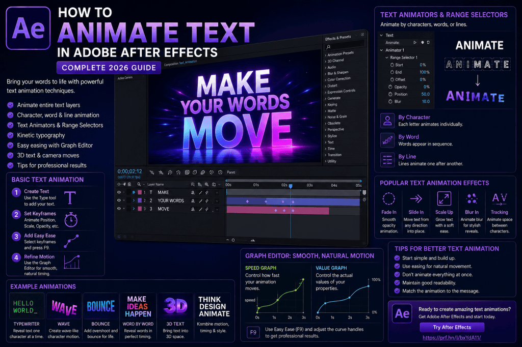
Method 2: Use After Effects Text Animators
Animating an entire layer is useful, but After Effects becomes much more powerful when you use its dedicated text-animation system.
Text Animators allow you to affect individual characters, words, or lines.
Instead of moving the whole title at once, you could make the letters appear one after another.
This is one of the features that makes After Effects particularly powerful for typography.
Where Are the Text Animators?
Select your text layer.
Expand it in the Timeline.
You’ll see a Text section.
Next to it is an Animate menu.
From this menu, you can add properties such as:
- Position;
- Scale;
- Rotation;
- Opacity;
- Tracking;
- Fill Color;
- Blur.
After Effects creates a Text Animator containing the selected property and a Range Selector.
The Range Selector controls which part of the text receives the animation.
Understanding the Range Selector
The Range Selector is one of the most important parts of After Effects text animation.
Imagine the word:
ANIMATION
You may want only the first three letters affected.
Or perhaps you want an animation to move progressively from the first letter to the last.
The Range Selector determines which characters are selected by the animator.
It typically includes controls such as:
- Start;
- End;
- Offset.
These values determine which part of the text receives the animated property.
Create a Character-by-Character Fade
Let’s build one of the most useful text effects.
Create a text layer.
Open:
Text → Animate → Opacity
Set the Animator’s Opacity to:
0%
Now use the Range Selector to progressively reveal the characters.
Animate the appropriate selector control so the text transitions from hidden characters to visible characters.
Preview.
Instead of the entire title fading in simultaneously, the letters appear progressively.
This is the basis of many sophisticated typography effects.
Animate Characters from Below
Now add Position to the Text Animator.
Move the animated characters downward.
The unselected characters remain in their normal position.
As the Range Selector moves through the text, each character travels upward into place.
Combine this with Opacity.
Now each character:
- begins lower;
- begins invisible;
- moves upward;
- becomes visible;
- settles into position.
This creates a much richer title animation.
Add Blur
You can also animate Blur.
Characters can begin:
- displaced;
- transparent;
- blurred;
and then become:
- correctly positioned;
- opaque;
- sharp.
This is an excellent technique for modern title design.
Use blur subtly.
Too much blur can make the animation feel messy rather than sophisticated.
Animate by Character, Word, or Line
Text animation doesn’t always need to operate letter by letter.
Depending on your Range Selector configuration, you can create animation based on:
Characters
Each letter animates individually.
Words
Entire words animate as units.
Lines
Individual lines animate sequentially.
The correct choice depends on the design.
A short title might look great character by character.
A paragraph is usually easier to read when animated by line or word.
Create a Word-by-Word Animation
Suppose your title says:
DESIGN BETTER MOTION GRAPHICS
Instead of animating every letter separately, animate each word.
The sequence becomes:
DESIGN
then
BETTER
then
MOTION
then
GRAPHICS.
This works particularly well for:
- advertising;
- presentations;
- social media;
- kinetic typography;
- explainer videos.
Create a Line-by-Line Title
Imagine a three-line headline:
LEARN
CREATE
ANIMATE
Animate each line upward with a slight delay.
The result feels organized and rhythmic.
This technique is especially useful for large editorial typography.
What Is a Text Animator?
A Text Animator is essentially a set of properties applied selectively to text.
For example:
Animator 1
Position = +50 pixels
Opacity = 0%
Blur = 10
The Range Selector determines which characters receive those values.
As the selector changes, different parts of the text move between the animated and normal states.
This separation between:
what changes
and
which characters change
is what makes the system so powerful.
Multiple Text Animators
A single text layer can contain multiple animators.
For example:
Animator 1
Controls character Position and Opacity.
Animator 2
Controls Rotation.
Animator 3
Controls Fill Color.
This lets you build sophisticated animation without creating a separate layer for every letter.
However, don’t make things complicated unnecessarily.
Use the simplest setup that achieves the result you need.
Animate Tracking
Tracking controls spacing between characters.
Animated tracking can create elegant typography.
Try starting with wider character spacing and gradually reducing it.
For example:
Beginning: widely spaced letters
End: normal tracking
Combine that with a subtle fade.
This can work beautifully for:
- luxury branding;
- film titles;
- corporate intros;
- minimalist motion graphics.
Animate Text Scale
You can also use a Text Animator to scale individual characters.
Instead of scaling the entire word simultaneously, characters can grow sequentially.
Combine:
Scale
Opacity
and
Position
for a more sophisticated reveal.
Again, restraint usually produces better results.
Animate Rotation
Rotation can add personality.
Characters might rotate slightly as they appear.
For example:
Beginning:
Rotation: -20°
End:
Rotation: 0°
Combined with Position and Opacity, this can create a playful entrance.
For serious corporate work, use smaller rotations.
For entertainment or children’s content, you can exaggerate more.
Anchor Points Matter
Rotation and Scale happen around anchor points.
If text seems to rotate or scale strangely, inspect the anchor-point behavior.
Understanding anchor points is essential when creating sophisticated text motion.
A letter rotating around an inappropriate point can look completely different from one rotating around its visual center or baseline.
Create an Overshoot Text Animation
Overshoot can make text feel more responsive.
For example, animate Scale:
90% → 105% → 100%
or Position:
Below final position → slightly above → final position
Then refine the motion with easing.
A small overshoot can create a polished settling effect.
A large overshoot can create a playful bounce.
Choose according to the visual style.
Create a Text Slide-In
This is a classic effect.
Start with the text outside the frame.
Animate Position into the composition.
Add:
- Easy Ease;
- Graph Editor refinement;
- motion blur.
You can also animate Opacity slightly.
Simple techniques executed well often look more professional than complicated effects executed poorly.
Create a Masked Text Reveal
Another useful technique is revealing text through a defined area.
Imagine text moving upward but only becoming visible once it crosses a specific boundary.
This creates a clean editorial reveal.
You can accomplish this using masks, mattes, or related compositing techniques depending on the setup.
The effect is widely used in modern title design.
Create a Typewriter Effect
A typewriter effect reveals text progressively as though someone is typing it.
After Effects text animation tools can create this behavior by controlling character visibility over time.
This works well for:
- computer interfaces;
- terminal simulations;
- documentary graphics;
- coding videos;
- storytelling.
You can enhance the effect with:
- a blinking cursor;
- typing sounds;
- slight timing variation.
Be careful not to make long paragraphs type too slowly.
Viewers should not have to wait unnecessarily for text they could already be reading.
Kinetic Typography
Kinetic typography is the art of using animated text as a primary visual element.
Instead of text simply appearing over footage, the typography itself becomes the animation.
Words can:
- move;
- scale;
- rotate;
- change color;
- collide;
- transform;
- respond to dialogue;
- synchronize with music.
After Effects is particularly well suited to this style because of its combination of:
- text animators;
- keyframes;
- Graph Editor;
- shape layers;
- expressions;
- 3D.
Synchronize Text with Audio
Text animation becomes particularly powerful when synchronized with speech or music.
For dialogue, emphasize important words.
For example:
Narration:
“Motion makes your STORY more powerful.”
You might keep most words relatively restrained while making STORY much larger or more dynamic.
For music, synchronize animation changes with beats.
This creates rhythm.
But avoid animating every single beat unless the style specifically calls for it.
Variation creates interest.
Use Hierarchy in Animated Typography
Not every word should have equal importance.
Use:
- size;
- weight;
- color;
- position;
- animation speed;
- movement;
to establish hierarchy.
The most important words can receive stronger motion.
Supporting words can remain calmer.
This helps viewers understand the message rather than simply watching visual activity.
Text Animation and Motion Blur
Fast-moving text can look unnaturally sharp without motion blur.
Enable motion blur where appropriate.
This can make:
- slide-ins;
- rotations;
- fast scale animations;
feel more natural.
However, too much blur reduces readability.
Typography must remain legible.
Keep Text on Screen Long Enough
One of the most common motion-design mistakes is removing text too quickly.
You already know what the title says because you created it.
The viewer doesn’t.
Give people time to:
- notice the text;
- read it;
- understand it.
Animation should support communication.
It shouldn’t make reading harder.
Don’t Animate Everything
Another common beginner mistake is making every word move differently.
One word rotates.
Another bounces.
Another zooms.
Another shakes.
Another flies toward the camera.
Technically impressive?
Perhaps.
Good design?
Usually not.
Create a consistent motion language.
For example:
Headlines
Slide upward and settle.
Subheadings
Fade in.
Keywords
Scale slightly for emphasis.
Captions
Use simple opacity transitions.
Consistency makes the design feel intentional.
Create a Reusable Text Animation
Once you create a text animation you like, consider building it so it can be reused.
For example, a lower-third design may be needed dozens of times across a video series.
Instead of rebuilding it every time, create a structured composition or template workflow.
This can dramatically improve production efficiency.
Text Animation for YouTube
After Effects is particularly useful for YouTube graphics.
You can create:
- animated titles;
- subscribe graphics;
- lower thirds;
- chapter titles;
- callouts;
- statistics;
- quotations;
- animated captions.
A consistent text-animation system can become part of your channel’s visual identity.
Text Animation for Social Media
Short-form content often depends heavily on text because many viewers initially watch without sound.
Animated typography can emphasize:
- hooks;
- statistics;
- product benefits;
- calls to action;
- key quotations.
But readability is critical.
Social content is often viewed on small screens.
Avoid tiny type and overly elaborate motion.
Text Animation for Corporate Video
Corporate motion graphics usually benefit from restraint.
Useful techniques include:
- subtle upward reveals;
- opacity fades;
- small tracking changes;
- gentle scale animation;
- line-by-line entrances.
Avoid excessive bouncing and rotation unless it fits the brand.
Professional doesn’t mean motionless.
It means controlled.
Text Animation for Advertisements
Advertising allows more expressive typography.
You might use:
- aggressive Scale changes;
- fast Position animation;
- kinetic typography;
- synchronized words;
- animated colors;
- 3D text;
- rapid transitions.
The animation should support the product and message rather than distract from them.
Text in 3D
After Effects text layers can participate in 3D compositions.
Enable 3D for the layer and you can position text along:
- X;
- Y;
- Z.
Now the text can move toward or away from the camera.
Combine this with a 3D camera for more sophisticated title sequences.
For example, you could position several words at different depths and move the camera through them.
Cameras and Text Animation
Animating a camera instead of individual text layers can create interesting results.
Imagine:
LEARN
at one depth.
CREATE
farther back.
ANIMATE
even farther away.
Move the camera through the scene.
The viewer travels from one word to the next.
This is a simple introduction to cinematic 3D typography.
Depth of Field
In Advanced 3D workflows, Depth of Field can add another level of visual depth.
One word can remain sharp while other text elements become blurred based on their distance from the focus plane.
Used carefully, this can create highly polished compositions.
Readability remains essential.
Don’t blur important text simply because the effect looks impressive.
Variable Fonts and Animation
Modern After Effects workflows can also take advantage of variable font capabilities where supported.
Variable fonts can expose adjustable axes such as:
- weight;
- width;
- slant;
- other typeface-specific properties.
Animating these properties can create typography that changes its actual letterform characteristics rather than simply changing Scale.
This opens interesting possibilities for motion designers.
Use Illustrator with Text-Based Motion Graphics
Not every typographic element needs to originate directly in After Effects.
Illustrator is useful for creating:
- logos;
- custom lettering;
- vector icons;
- typographic compositions.
After Effects can then animate those assets.
Recent improvements to Illustrator/SVG workflows make vector-based motion design increasingly convenient.
Text Animation and Expressions
Once you’re comfortable with keyframes and Text Animators, expressions open another level of control.
Expressions can help create:
- automatic delays;
- procedural movement;
- loops;
- random animation;
- responsive text systems.
But don’t rush into expressions.
Learn the native text-animation system first.
You’ll understand expressions much better once you know what you want them to automate.
Common Text Animation Mistakes
Mistake 1: Too Much Movement
More movement doesn’t automatically mean better animation.
Mistake 2: Poor Readability
Text exists to communicate.
Never sacrifice readability without a deliberate reason.
Mistake 3: Linear Keyframes
Mechanical timing can make even attractive typography feel amateurish.
Use easing and the Graph Editor.
Mistake 4: Animating Every Word Differently
Consistency creates a stronger motion language.
Mistake 5: Too Many Fonts
Animation doesn’t remove the need for good typography.
Use a controlled type system.
Mistake 6: Ignoring Timing
Give viewers enough time to read.
Mistake 7: Overusing Presets
Presets are useful, but understanding how the animation works gives you much more control.
Five Text Animation Exercises
If you’re learning, try these.
Exercise 1 — Simple Fade
Animate Opacity from 0% to 100%.
Exercise 2 — Slide and Fade
Combine Position and Opacity.
Exercise 3 — Character Reveal
Use a Text Animator and Range Selector.
Exercise 4 — Tracking Animation
Animate wide character spacing into normal spacing.
Exercise 5 — Kinetic Typography
Take a five-second spoken sentence and animate its most important words.
Completing these exercises will teach you far more than simply browsing animation presets.
A Better Text Animation Workflow
Use this process.
1. Write the Message
Know exactly what the text needs to communicate.
2. Design the Static Frame
Choose typography, size, spacing, and hierarchy.
3. Decide the Motion Style
Should it feel energetic, elegant, technical, playful, or cinematic?
4. Create Keyframes
Build the fundamental movement.
5. Add Easing
Remove mechanical motion.
6. Refine in the Graph Editor
Shape acceleration and deceleration.
7. Add Secondary Motion
Consider subtle Scale, Rotation, Blur, or tracking changes.
8. Check Readability
Watch the animation as a viewer rather than as its creator.
9. Add Motion Blur
Where appropriate.
10. Simplify
Remove anything that doesn’t improve the result.
How to Make Text Animation Look Professional
Professional text animation usually comes down to a few fundamentals:
Good typography
Choose appropriate type and spacing.
Good timing
Movement should not feel rushed or sluggish.
Good easing
Avoid mechanical starts and stops.
Hierarchy
Important words should receive appropriate emphasis.
Consistency
Use a coherent motion language.
Restraint
Don’t add movement simply because you can.
These principles matter more than having hundreds of presets.
Do You Need Text Animation Plug-Ins?
No.
After Effects contains powerful native typography tools.
You can create sophisticated animation using:
- Transform properties;
- Text Animators;
- Range Selectors;
- keyframes;
- Graph Editor;
- masks;
- mattes;
- expressions;
- 3D.
Third-party tools can certainly speed up workflows and provide additional creative options.
But beginners should understand the native system first.
Is After Effects Good for Kinetic Typography?
Yes.
Kinetic typography is one of After Effects’ strongest use cases.
Its combination of detailed text control, keyframe animation, selectors, easing, compositing, and audio synchronization makes it exceptionally flexible.
And because After Effects is not limited to typography, you can combine animated text with:
- footage;
- illustrations;
- photographs;
- shapes;
- 3D;
- visual effects.
That makes it suitable for everything from simple title cards to elaborate motion-design sequences.
Practice Text Animation in After Effects
The best way to learn is to build something small.
Create a five-second composition containing the phrase:
MAKE IDEAS MOVE
Animate:
MAKE
with Position.
IDEAS
with Scale.
MOVE
with a Text Animator.
Then refine the timing so the entire phrase feels connected rather than like three unrelated effects.
That final step is where motion design begins.
If you want to start practicing, you can check Adobe’s current After Effects plans and trial options here:
Explore Adobe After Effects and start creating text animations
Frequently Asked Questions
How do I animate text in After Effects?
You can animate the entire text layer using standard Transform properties such as Position, Scale, Rotation, and Opacity, or use dedicated Text Animators to control individual characters, words, and lines.
What is a Text Animator?
A Text Animator lets you apply animated properties selectively to portions of a text layer.
What is a Range Selector?
A Range Selector determines which characters, words, or lines are affected by a Text Animator.
Can I animate individual letters?
Yes. After Effects’ text-animation system can animate individual characters without requiring every letter to exist on a separate layer.
Can I animate text word by word?
Yes. Text Animators can be configured for word-based animation.
Can I animate text line by line?
Yes. This is particularly useful for multi-line titles and presentation graphics.
Can I create a typewriter effect?
Yes. Character-based text animation can be used to reveal text progressively.
Can I animate tracking?
Yes. Tracking can be animated to change spacing between characters over time.
Can text be animated in 3D?
Yes. Text layers can participate in After Effects 3D workflows and interact with cameras and other 3D elements.
Do I need a plug-in?
No. After Effects includes extensive native text-animation tools.
What Should You Learn Next?
Once you understand text animation, the next logical skill is shape layers.
Shape layers are central to modern motion graphics.
They’re used to create:
- icons;
- lines;
- backgrounds;
- buttons;
- charts;
- diagrams;
- abstract graphics;
- explainer animations.
And just like text, almost every aspect of a shape can be animated.
That makes shape layers the ideal next step in our After Effects learning sequence.
Final Thoughts
Text animation is much more than making words move.
Good typography already communicates through:
- size;
- spacing;
- weight;
- position;
- hierarchy.
Animation adds another dimension:
time.
A word can arrive quickly.
Another can appear slowly.
A keyword can grow.
A sentence can reveal itself character by character.
A headline can travel through 3D space.
After Effects gives you detailed control over all of these possibilities.
But the best results usually come from mastering the fundamentals rather than adding the most effects.
Start with:
Position + Opacity + Easy Ease.
Then learn:
Graph Editor.
Then explore:
Text Animators + Range Selectors.
After that, experiment with tracking, blur, character animation, kinetic typography, and 3D.
Most importantly, keep the purpose of the text in mind.
The viewer needs to read and understand it.
The animation should make that communication stronger.
When typography, timing, and motion work together, even a few simple words can become a compelling piece of motion design.
Get Adobe After Effects and start experimenting with animated typography