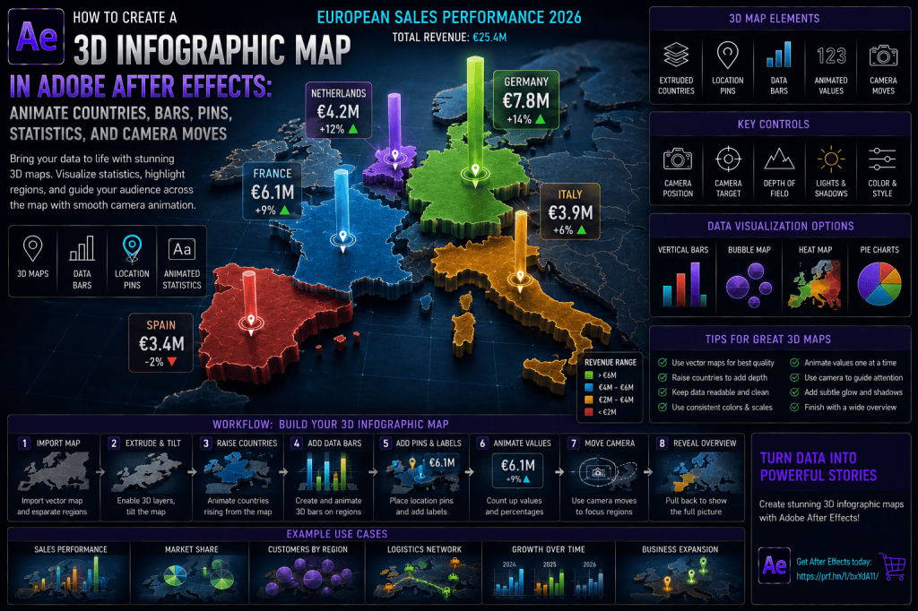
A 3D infographic map takes geographic data visualization beyond flat country highlights and simple animated numbers.
Instead of looking straight down at a 2D map, you can tilt the map into perspective, raise selected regions, add vertical bars and pins, animate statistics above locations, and move a Camera across the scene.
The result feels less like a conventional infographic and more like a cinematic data environment.
This technique is useful for:
- regional sales presentations;
- business expansion;
- logistics;
- market analysis;
- tourism;
- real estate;
- infrastructure;
- cloud regions;
- customer distribution;
- population data;
- supply chains;
- executive presentations;
- geographic storytelling.
The basic workflow is:
map → separate regions → 3D perspective → raised countries → bars and pins → values → Camera movement → final overview
In this tutorial, we’ll create the complete effect using native Adobe After Effects tools.
Affiliate disclosure: This article contains affiliate links. If you purchase Adobe After Effects through one of these links, we may earn a commission at no additional cost to you.
What Is a 3D Infographic Map?
Imagine a map of Europe viewed from a low angle.
Germany rises slightly above the base map.
A tall bar grows from Berlin.
A marker appears.
A value counts upward:
€7.8M
The Camera moves toward France.
France rises.
A second data bar appears:
€6.1M
The Camera continues across the scene.
By the end, several countries are highlighted in 3D and their data values are visible simultaneously.
The geography provides context.
The 3D elements provide visual hierarchy.
The Camera determines the sequence in which viewers understand the information.
If you’d like to follow along, you can explore Adobe’s current After Effects options here:
Explore Adobe After Effects and current plans
Step 1: Choose the Geographic Area
For the example project, we’ll use:
Europe
with these countries:
Germany.
France.
Netherlands.
Italy.
Spain.
You can use the same technique with:
world maps.
countries.
states.
provinces.
sales territories.
custom regions.
Step 2: Define the Data
Example annual revenue:
Germany — €7.8M
France — €6.1M
Netherlands — €4.2M
Italy — €3.9M
Spain — €3.4M
We’ll use these values to control the heights of the data bars.
Step 3: Create the Master Composition
Create a new composition:
3D_INFOGRAPHIC_MAP_MASTER
For example:
1920 × 1080.
30 fps.
15 seconds.
Use a dark neutral background.
Step 4: Import a Vector Map
A vector map is ideal because individual regions can be separated.
Import an Illustrator file or use separate Shape Layers.
Ideally, every important country should exist on its own layer.
Step 5: Create the Base Map
Place a complete Europe map at the bottom of the composition.
Rename:
MAP_BASE
Keep it relatively dark.
This layer provides geographic context.
Step 6: Create Separate Highlight Layers
Create:
GERMANY
FRANCE
NETHERLANDS
ITALY
SPAIN
Place them precisely above MAP_BASE.
Project 1: Flat Region Map
Before adding 3D:
make sure all regions align correctly.
Change Fill colors temporarily if needed to verify their shapes.
Step 7: Enable 3D
Enable the:
3D Layer switch
for:
MAP_BASE
and all individual country layers.
Now each region can be moved independently in Z space.
Step 8: Tilt the Map
Create a 3D Null:
MAP_CTRL
Parent all map layers to it.
Rotate:
X Rotation
until the map appears tilted away from the Camera.
For example:
approximately 55–70 degrees depending on the Camera.
The map now begins to resemble a physical surface.
Step 9: Add a Camera
Choose:
Layer → New → Camera
Try:
35mm
as a starting point.
Create:
CAM_CTRL
as a 3D Null.
Parent Camera to it.
Step 10: Position the Camera
Move the Camera above and slightly in front of the map.
Aim toward the center of Europe.
You should now see the map in perspective.
Project 2: Basic 3D Map
Create:
base map.
five regions.
tilted perspective.
Camera.
No data yet.
The goal is to establish a convincing geographic surface.
Step 11: Raise a Country
Select:
GERMANY
Move it slightly toward the Camera along Z relative to the base map.
The region now appears elevated.
Step 12: Add a Shadow
Create a subtle dark duplicate or offset layer beneath Germany.
Blur it slightly.
Reduce Opacity.
This can simulate separation between the raised country and the map surface.
Step 13: Animate the Region Rising
Start:
Germany aligned with base map.
Animate:
Z Position upward.
At the same time:
increase brightness slightly.
This makes the country appear to lift from the map.
Project 3: Country Lift Animation
Germany rises.
Shadow appears.
Outline brightens.
Value has not appeared yet.
This alone can create a strong infographic effect.
Step 14: Repeat for Other Countries
Animate:
France.
Netherlands.
Italy.
Spain.
Stagger the timing.
Step 15: Keep Inactive Regions Lower
The active country can remain slightly higher than the others.
This creates clear focus.
Step 16: Add Country Outlines
Use a Stroke or duplicated outline layer.
Bright outlines help raised regions separate from the base map.
Step 17: Add Glow Carefully
A small Glow can emphasize the active region.
Avoid making every country glow strongly at the same time.
Step 18: Create the First Data Bar
Create a rectangle Shape Layer.
Rename:
BAR_GERMANY
Enable:
3D.
Position it above Germany.
Step 19: Move the Anchor Point
Place the Anchor Point at the bottom of the bar.
This allows it to grow upward.
Step 20: Determine Bar Scale
Use a consistent scale.
For example:
€8M = 400 px.
Germany €7.8M:
approximately 390 px.
France €6.1M:
approximately 305 px.
Netherlands €4.2M:
approximately 210 px.
Italy €3.9M:
approximately 195 px.
Spain €3.4M:
approximately 170 px.
The exact pixel scale can change, but the proportional relationship should remain accurate.
Step 21: Animate the Bar
Set:
Scale Y = 0%.
Animate to:
100%.
Apply:
Easy Ease.
The bar rises from the map.
Step 22: Make the Bar Look 3D
A flat Shape Layer can be enough.
For more depth, create:
front face.
side face.
top face.
Parent them to:
BAR_GERMANY_CTRL
This produces a box-like data column.
Project 4: 3D Revenue Column
Germany rises.
Data column grows.
Camera moves slightly.
The bar’s side becomes visible because of perspective.
Step 23: Add the Value
Create:
€7.8M
as a Text Layer.
Enable 3D.
Place it above the bar.
Step 24: Add Country Name
Create:
GERMANY
Place it beneath or beside the value.
Use clear typographic hierarchy.
Step 25: Add Growth Percentage
For example:
+14%
Place it below the main value.
Use:
arrow.
icon.
or text.
Don’t rely on color alone to communicate increase or decline.
Step 26: Animate the Number
Count from:
€0
to:
€7.8M.
Synchronize the number with bar growth.
Project 5: Complete Germany Data Point
Country rises.
Bar grows.
€7.8M counts upward.
+14% appears.
Camera holds.
Then continue to next region.
Step 27: Add France
Create:
BAR_FRANCE.
VALUE_FRANCE.
LABEL_FRANCE.
Animate them after Germany.
Step 28: Continue with All Regions
Add:
Netherlands.
Italy.
Spain.
Each country receives:
region lift.
bar.
value.
growth label.
Step 29: Use Sequential Camera Movement
Move Camera from:
Germany
to:
France
to:
Netherlands
to:
Italy
to:
Spain.
The Camera guides the data story.
Step 30: Give the Camera Time to Stop
At each region:
slow.
hold briefly.
allow the value to appear.
Then continue.
Project 6: European Revenue Tour
Camera enters from wide view.
Germany activates.
France.
Netherlands.
Italy.
Spain.
Finish on full Europe view.
Step 31: Use Camera Anticipation
Before leaving one region:
shift the framing slightly toward the next.
This gives viewers a visual cue about where the motion is going.
Step 32: Add Depth of Field
Enable:
Camera Options → Depth of Field
Focus on the active region.
Allow distant regions to soften slightly.
Important
Do not blur values that viewers need to read.
Keep Depth of Field subtle for data visualization.
Step 33: Add Location Pins
Not every statistic needs a bar.
Create a map pin above a city.
For example:
Berlin.
Paris.
Amsterdam.
Rome.
Madrid.
Step 34: Create a Pin Animation
Animate:
Scale:
0% → 115% → 100%.
Add a pulse ring below the pin.
Step 35: Add City Labels
Place:
BERLIN.
PARIS.
AMSTERDAM.
ROME.
MADRID.
above or beside the pins.
Project 7: City Pin Map
Countries remain flat.
Cities pop upward with pins.
Values appear beside them.
This works well for:
office locations.
stores.
warehouses.
events.
Step 36: Combine Pins and Bars
Use:
bar = regional volume.
pin = exact location.
For example:
Germany bar = national sales.
Berlin pin = headquarters.
This combines macro and local information.
Step 37: Add Bubble Markers
Create circles above countries.
Scale bubble size according to value.
This creates a 3D bubble map.
Project 8: Customer Distribution Map
Bars show:
revenue.
Bubbles show:
number of customers.
Use separate visual encodings consistently.
Step 38: Add Regional Percentage Rings
Create circular progress indicators above regions.
For example:
Germany:
31%.
France:
24%.
Netherlands:
17%.
Animate the ring Stroke with Trim Paths.
Step 39: Add Data Cards
Create a small floating information card.
For example:
GERMANY
Revenue: €7.8M
Growth: +14%
Customers: 12,400
Place it near the active region.
Project 9: Executive Map Callouts
Camera approaches Germany.
Floating card appears.
Camera leaves.
Card fades.
France card appears next.
This reduces label clutter.
Step 40: Create a Vertical Leader Line
Connect the map region to a floating value using a thin vertical line.
This is useful when the Camera angle makes placement difficult.
Step 41: Add a Grid Beneath the Map
Create a larger grid plane beneath Europe.
This can create a digital or technology aesthetic.
Keep it subtle.
Step 42: Add Atmospheric Particles
Use small particles above the map.
This adds dimensional depth.
Don’t let particles interfere with data readability.
Step 43: Add Horizon Glow
A soft light behind the map can help separate the geography from the background.
Project 10: Futuristic Data Map
Dark background.
blue/cyan grid.
raised countries.
glowing bars.
particles.
low Camera.
This works well for technology and AI presentations.
Step 44: Create a Corporate Style
For a more restrained business presentation:
reduce Glow.
use neutral colors.
use slower Camera movement.
keep bars clean.
minimize particles.
Step 45: Create a Broadcast Style
Use:
bold region colors.
short Camera moves.
strong labels.
clean numeric callouts.
This works well for news or sports graphics.
Step 46: Create a Real-Estate Map
Use a city or regional map.
Raise neighborhoods.
Add location pins.
Show:
price.
population.
distance.
amenities.
Project 11: Property Location Map
Region raised.
Property pin.
Distance to city center.
Transport marker.
Final Camera push to property location.
Step 47: Create a Logistics Map
Use:
ports.
warehouses.
distribution hubs.
Data bars can represent:
shipments.
capacity.
inventory.
Step 48: Add Routes
Draw Shape Layer paths between logistics nodes.
Use:
Trim Paths.
Animate moving pulses or vehicles.
Project 12: 3D Logistics Map
Raised regions.
Warehouse pins.
Shipment bars.
Animated routes.
Camera moves between hubs.
This combines several previous techniques.
Step 49: Create a Market Share Map
Use country height instead of a separate bar.
For example:
Germany rises higher than Spain based on market share.
Important
If region height represents data, make that relationship clear.
A legend may be necessary.
Step 50: Animate Region Height from Data
Use:
Z Position
or simulated extrusion depth
to encode the metric.
This can create a topographic-style infographic.
Project 13: Raised Country Data Map
All countries begin flat.
Germany rises highest.
France next.
Netherlands next.
Camera orbits.
Values appear.
Step 51: Add a Legend
Explain:
bar height.
country color.
pin type.
route type.
If visual encodings aren’t self-explanatory, always add a legend.
Step 52: Add a KPI Panel
Place a dashboard beside the map.
For example:
TOTAL REVENUE
€25.4M
GROWTH
+11.8%
TOP MARKET
Germany
MARKETS
5
Step 53: Animate KPI Updates
As each region becomes active:
update the summary values.
Project 14: Map + Executive Dashboard
Map:
left two-thirds.
KPI panel:
right one-third.
Camera moves subtly.
Values update.
This works well for corporate reporting.
Step 54: Add a Year Counter
For temporal maps:
Animate country bars and values as the year changes.
Step 55: Create Year-over-Year Growth
Animate:
2024 state.
transition.
2025 values increase.
transition.
2026 values increase again.
Project 15: Three-Year European Growth
Map remains constant.
Bars grow between years.
New markets activate.
Total revenue updates.
Step 56: Add Forecasts
Use a different visual style for forecast periods.
For example:
historical bars:
solid.
forecast bars:
semi-transparent.
This helps preserve data integrity.
Step 57: Create a Scenario Map
Compare:
base case.
high case.
low case.
Use a control or separate sequences.
Avoid displaying all scenarios simultaneously if it becomes confusing.
Step 58: Add Motion Blur
Use Motion Blur mainly for:
Camera transitions.
fast bars.
moving pins.
route pulses.
Data labels should remain sharp.
Step 59: Create Global Controls
Create:
INFO_MAP_CTRL
Add controls for:
Map Opacity.
Region Height.
Glow.
Bar Scale.
Pin Scale.
Label Opacity.
Camera Speed.
Step 60: Organize the Project
Recommended folders:
MAP_BASE
REGIONS
BARS
PINS
VALUES
CALL_OUTS
ROUTES
CAMERA
CONTROLS
BACKGROUND
Use Clear Layer Names
Examples:
GERMANY_REGION.
GERMANY_BAR.
GERMANY_VALUE.
GERMANY_PIN.
GERMANY_SHADOW.
This becomes important when dozens of geographic elements exist.
Data Accuracy Still Comes First
A 3D presentation doesn’t change the responsibilities of good data visualization.
If bar height represents revenue:
use proportional bar heights.
If bubble size represents customers:
use a consistent scale.
If country elevation represents market share:
explain it.
Perspective Can Distort Comparison
A distant bar may appear smaller than a closer one even if it’s numerically larger.
For precise comparisons:
use visible numerical labels.
or:
finish with a more frontal view.
Camera Movement Should Support the Data
The Camera shouldn’t move simply because the composition is 3D.
Every move should help:
reveal.
compare.
transition.
or:
summarize.
Common Mistake: Map Angle Is Too Extreme
Keep enough geography visible to identify regions.
Common Mistake: Countries Don’t Align
Verify all layers before tilting into 3D.
Common Mistake: Region Lift Is Excessive
A small amount of height is often enough.
Common Mistake: Bars Hide Countries
Position data elements carefully.
Common Mistake: Camera Perspective Makes Data Misleading
Use numerical labels.
Common Mistake: Depth of Field Blurs Values
Keep active data readable.
Common Mistake: Too Much Glow
Preserve clean boundaries.
Common Mistake: Everything Is Animated at Once
Reveal one region at a time.
Common Mistake: No Final Overview
Finish with the complete geographic story.
Common Mistake: No Visual Legend
Explain any unusual encoding.
Basic 3D Infographic Map Quick Recipe
- Import vector map.
- Separate regions.
- Create dark base map.
- Enable 3D.
- Parent to MAP_CTRL.
- Tilt map.
- Add Camera.
- Raise first region.
- Add shadow.
- Create data bar.
- Animate bar growth.
- Add value.
- Add growth indicator.
- Repeat for regions.
- Add pins.
- Move Camera between regions.
- Add Depth of Field carefully.
- Finish with wide overview.
Corporate Revenue Map Recipe
Use:
neutral map.
raised markets.
clean vertical bars.
revenue values.
growth indicators.
slow Camera.
total KPI.
Technology Map Recipe
Use:
dark map.
grid floor.
cyan/purple accents.
Glow.
particles.
raised regions.
data routes.
Logistics Map Recipe
Use:
regional hubs.
location pins.
shipment bars.
animated transport routes.
Camera movement.
Real-Estate Map Recipe
Use:
local map.
raised districts.
property pins.
price callouts.
transport links.
Camera push.
Executive Dashboard Map Recipe
Combine:
3D map.
regional statistics.
KPI cards.
Camera overview.
total performance.
Five Essential 3D Map Exercises
Exercise 1 — Tilt the Map
Turn a flat vector map into a perspective surface.
Exercise 2 — Raise a Region
Animate one country above the base map.
Exercise 3 — Add a Data Bar
Grow an accurate value column.
Exercise 4 — Add Pins and Labels
Mark exact locations.
Exercise 5 — Camera Data Tour
Move through several regions and finish wide.
Master these five exercises and you’ll understand the foundation behind cinematic geographic infographics.
Frequently Asked Questions
Can I create a 3D infographic map in After Effects?
Yes.
Separate map regions into 3D layers, tilt them into perspective, and add bars, pins, values, and Camera animation.
Do I need a plug-in?
No.
The core workflow can be created using native After Effects tools.
Can I raise individual countries?
Yes.
Move separated region layers in Z space.
Can I animate bars from countries?
Yes.
Use Shape Layers with anchor points positioned at the base.
Can I add location pins?
Yes.
Pins can be 3D Layers placed slightly above the map.
Can I animate values?
Yes.
Use Text Layers and expressions or keyframes.
Can I add a Camera?
Yes.
Camera movement is one of the key advantages of this technique.
Can I add Depth of Field?
Yes.
Use it carefully so statistics remain readable.
Can I combine the map with routes?
Yes.
Route animations work particularly well for logistics and network visualization.
Can region height represent data?
Yes.
But clearly explain the scale and avoid misleading perspective.
Can I animate several years?
Yes.
Update bars, values, and region highlights as a year counter advances.
Can I create a reusable template?
Yes.
Centralized controls and consistent pre-compositions make the project highly reusable.
Practice Project: 3D European Revenue Map
Create:
3D_INFOGRAPHIC_MAP_MASTER
at:
1920 × 1080.
Add a Europe vector map.
Separate:
Germany.
France.
Netherlands.
Italy.
Spain.
Create a dark base map.
Enable 3D.
Tilt the map.
Create:
CAM_MAIN.
CAM_CTRL.
Animate Germany rising.
Grow a bar representing:
€7.8M
Add:
+14%
Then repeat:
France — €6.1M.
Netherlands — €4.2M.
Italy — €3.9M.
Spain — €3.4M.
Move the Camera between the countries.
Add city pins:
Berlin.
Paris.
Amsterdam.
Rome.
Madrid.
Finally:
pull backward.
Show all five countries and bars.
Display:
TOTAL REVENUE: €25.4M
and:
EUROPEAN SALES PERFORMANCE 2026
That single exercise teaches:
3D maps,
raised regions,
data bars,
location markers,
animated values,
Camera movement,
Depth of Field,
and:
geographic storytelling.
If you’d like to build the project yourself, you can explore Adobe’s current After Effects options below:
What Should You Learn Next?
After creating a 3D infographic map, the next useful step is learning how to build a 3D extruded map look where countries and regions appear as thicker physical objects rather than flat layers.
We’ll focus on:
- map depth;
- extrusion-style edges;
- regional height;
- shadows;
- materials;
- lighting;
- Camera orbit;
- layered geographic relief.
The next article will therefore be:
How to Create a 3D Extruded Map in Adobe After Effects: Add Depth, Raised Countries, Shadows, and Camera Animation.
Final Thoughts
A 3D infographic map is most effective when the three-dimensional treatment helps viewers understand the geography and data rather than distracting from it.
The basic structure remains simple:
map for context,
raised regions for focus,
bars and pins for data,
labels for precision,
and:
Camera movement for sequence.
Build the project gradually.
Start with a clean flat map.
Tilt it.
Raise one region.
Add one statistic.
Then introduce the Camera.
Only after that foundation works should you add:
Glow.
Depth of Field.
particles.
routes.
dashboards.
or other decorative elements.
That disciplined approach creates geographic visualizations that are cinematic without sacrificing clarity.
Explore Adobe After Effects and start creating professional 3D infographic map animations