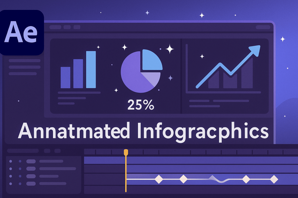
Static charts are fine for reports, but animated infographics grab attention and make data easier to understand. Adobe After Effects lets you turn boring numbers into engaging visual stories using shapes, text, and simple animations.
🎬 Step 1: Set Up Your Composition
- Create a new comp (1920×1080, 30 fps, 10–15 seconds).
- Decide on your infographic style: bar charts, pie charts, line graphs, or icons.
- Import any assets (logos, icons) you want to include.
📊 Step 2: Build Your Chart
- Bar Chart: Use Shape Layers (Rectangle Tool) for bars.
- Pie Chart: Use an Ellipse Shape with Trim Paths for animated slices.
- Line Graph: Use the Pen Tool to draw a line and animate the stroke.
- Add text labels for clarity (titles, percentages, captions).
👉 Pro Tip: Keep designs clean and readable — avoid overloading with colors and effects.
🎨 Step 3: Animate the Data
- Trim Paths: Reveal lines or circles gradually.
- Scale Animation: Make bars grow from 0% to their full value.
- Opacity/Fade In: Reveal labels and numbers smoothly.
- Ease Keyframes (F9): Add natural motion to every element.
⚡ Step 4: Add Motion Design Polish
- Use parenting so labels move with chart elements.
- Add motion blur for realism.
- Animate icons or illustrations alongside your data.
- Sync data reveals with a voiceover or background music.
🧪 Step 5: Reuse with Expressions
For dynamic charts, use expressions:
- Bar Growth:
value*time/5(bar grows automatically over time). - Random Variation:
wiggle(1,10)for fluctuating numbers.
🎯 Final Thoughts
Animated infographics make information easier to digest and far more engaging. With shape layers, trim paths, and simple expressions, you can turn raw data into a compelling motion story.
👉 Want to create your own? Download Adobe After Effects free trial and start animating your first infographic today.